Midterm Study Guide Solutions
Concepts and main ideas
Question 1
- it’s the cutoff point on the number line that has 38% of your data values below and 62% of the values above;
- yes I could;
- smaller than.
- It measures the strength and direction of the linear association between two numerical variables;
- \(Y=\beta_0+\beta_1 X + \varepsilon\) is the “true,” population relationship between \(X\) and \(Y\). \(\hat{Y}=b_0+b_1 X\) is the estimated relationship based on a sample of imperfect data;
- The line is chosen to make the sum of squared residuals as small as possible;
- A formula goes in the blank. This is
Rsyntax likey ~ x + zwhere you tell the computer which columns in your data frame you want to use, and how to use them. Predictors go on the righthand side of the tilde, and the response variable goes on the left; - If it makes sense for the predictor to take on a value of zero, and if the model prediction at zero is a value that the response could plausibly take, then the intercept is meaningful;
- The computer creates two dummy variables indicating whether or not an observation belongs to the two levels of the categorical predictor that are not the base level. Then it runs a multiple linear regression with those two dummies as predictors;
- \(\hat{y}^{(\text{new})} = \hat{y}^{(\text{old})} + b_1\);
- It measures the proportion of the variation in the response variable explained by the model;
- Unadjusted \(R^2\) always goes up when you add any new variable to a linear regression model, even if that variable is worthless. Unadjusted \(R^2\) penalizes the addition of irrelevant predictors.
- \(\hat{o}^{(\text{new})}=\hat{o}^{(\text{old})}\times e^{b_1}\);
- Always Be Visualizing! Wildly different datasets could have very similar numerical summaries. Actually plot the data so that you aren’t fooled;
Visual understanding
Question 3 (barplot matching)
- c
- f
- b
- d
- e
- a
Question 4 (scatterplot matching)
Pay attention to center, spread, and symmetry:
- e
- d
- b
- a
- c
- f
Question 5 (logistic matching)
- This is the plain vanilla one;
- Like an additive linear regression, the inclusion of the categorical predictor (with two levels) means that each level gets its own curve;
- Negative “slope” means the probability goes down as \(x\) increases;
- The negative “intercept” makes the probability at \(x=0\) tiny, so the curve shifts right;
- The bigger “slope” means the probability increases faster as \(x\) increases, so steep curve;
- The itty bitty “slope” means the probability increases slower as \(x\) increases, so flatter curve.
STAWANOWA doctor
- Causal-sounding language that makes the prediction sound like a guarantee;
- A one unit (which is measured in thousands of characters here) increase in the predictor is associated with a decrease by -0.0621 in the estimated log-odds, not the probability;
- Holding bill length constant, a one unit increase in flipper length is associated with a 48.14 gram increase in body mass, on average;
- 1.74 is not the slope between flipper length and body mass for Chinstrap penguins. It’s the adjustment that must be made to the baseline slope of 32.8 in order to get the Chinstrap slope. Those interaction terms are slope adjusters, not slopes themselves;
-
\(R^2\) is percent of variation in the response that is explained by the model.
mpgis the predictor here (since it’s to the right of the tilde); - \(e^{-2.218}\approx 0.10886\) is the odds of the email being spam. The probability would be \(\frac{e^{-2.218}}{1+e^{-2.218}}\approx 0.098\);
- The base level is female, not male, so the intercept applies to the female penguins;
- Correlation applies to pairs of numerical variables. We don’t talk about correlation between three variables. Since this is multiple linear regression instead of simple, we cannot interpret the \(R^2\) as literally the square of a correlation coefficient;
Data analysis
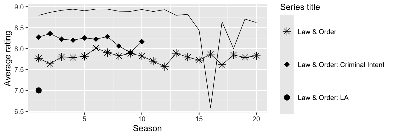
Law and order
- a, d
Blizzard salaries
- Option 1 - A shared x-axis makes it easier to compare summary statistics for the variable on the x-axis;
- c - It’s a value higher than the median for hourly but lower than the mean for salaried.
- b - There is more variability around the mean compared to the hourly distribution.
- a, b, e - Pie charts and waffle charts are for visualizing distributions of categorical data only. Scatterplots are for visualizing the relationship between two numerical variables.
- b - Option 2. The plot in Option 1 shows the number of employees with a given performance rating for each salary type while the plot in Option 2 gives the proportion of employees with a given performance rating for each salary type. In order to assess the relationship between these variables (e.g., how much more likely is a Top rating among Salaried vs. Hourly workers), we need the proportions, not the counts.
- There may be some
NAs in these two variables that are not visible in the plot. - The proportions under Hourly would go in the Hourly bar, and those under Salaried would go in the Salaried bar.
- c, d, e, f.
- (c) For every additional $1,000 of annual salary, the model predicts the raise to be higher, on average, by 0.0155%.
- (d) \(R^2\) of
raise_2_fitis higher than \(R^2\) ofraise_1_fitsinceraise_2_fithas one more predictor - The reference level of
performance_ratingis High, since it’s the first level alphabetically. Therefore, the coefficient -2.40% is the predicted difference in raise comparing High to Successful. In this context a negative coefficient makes sense since we would expect those with High performance rating to get higher raises than those with Successful performance. - (c) Option 3. It’s a linear model with no interaction effect, so parallel lines. And since the slope for
salary_typeSalariedis positive, its intercept is higher. The equations of the lines are as follows:Hourly: \[ \begin{align*} \widehat{percent\_incr} &= 1.24 + 0.0000137 \times annual\_salary + 0.913 \times salary\_typeSalaried \\ &= 1.24 + 0.0000137 \times annual\_salary + 0.913 \times 0 \\ &= 1.24 + 0.0000137 \times annual\_salary \end{align*} \]
Salaried: \[ \begin{align*} \widehat{percent\_incr} &= 1.24 + 0.0000137 \times annual\_salary + 0.913 \times salary\_typeSalaried \\ &= 1.24 + 0.0000137 \times annual\_salary + 0.913 \times 1 \\ &= 2.153 + 0.0000137 \times annual\_salary \end{align*} \]
- (c) The model predicts that the percentage increase employees with Successful performance get, on average, is higher by a factor of 1025 compared to the employees with Poor performance rating.
Movies
- (e) Blue City \(>\) Rang De Basanti \(>\) Winter Sleep
- (b) 31% of the variability in movie scores is explained by their runtime.
- (b) A value between 0 and 0.434.
- (e) G-rated movies that are 0 minutes in length are predicted to score, on average, 4.525 points.
- (c) All else held constant, for each additional minute of runtime, movie scores will be higher by 0.021 points on average.
- (c) is greater than
- (a) \(\widehat{score} = (4.525 - 0.257) + 0.021 \times runtime\)
-
score ~ runtime + yearis best because it has the highest adjusted \(R^2\); - Same model:
score ~ runtime + year. Forward stepwise isn’t guaranteed to find the best model, but here it does. - Same model:
score ~ runtime + year. Backward elimination isn’t guaranteed to find the best model, but here it does.