Exploratory Data Analysis, Part I
Lecture 2
2026-09-01
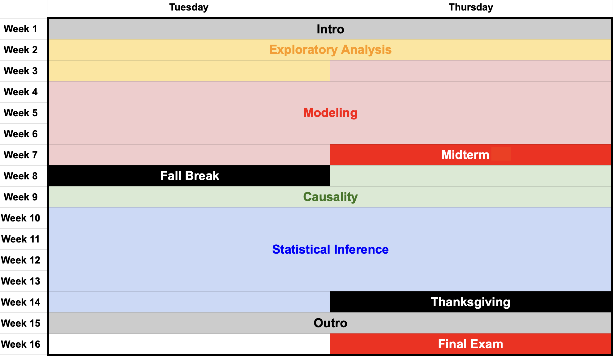
The shape of the course
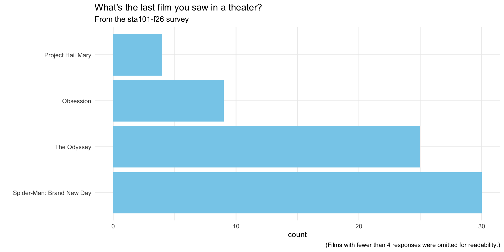
What’s the last movie you saw in a theater?
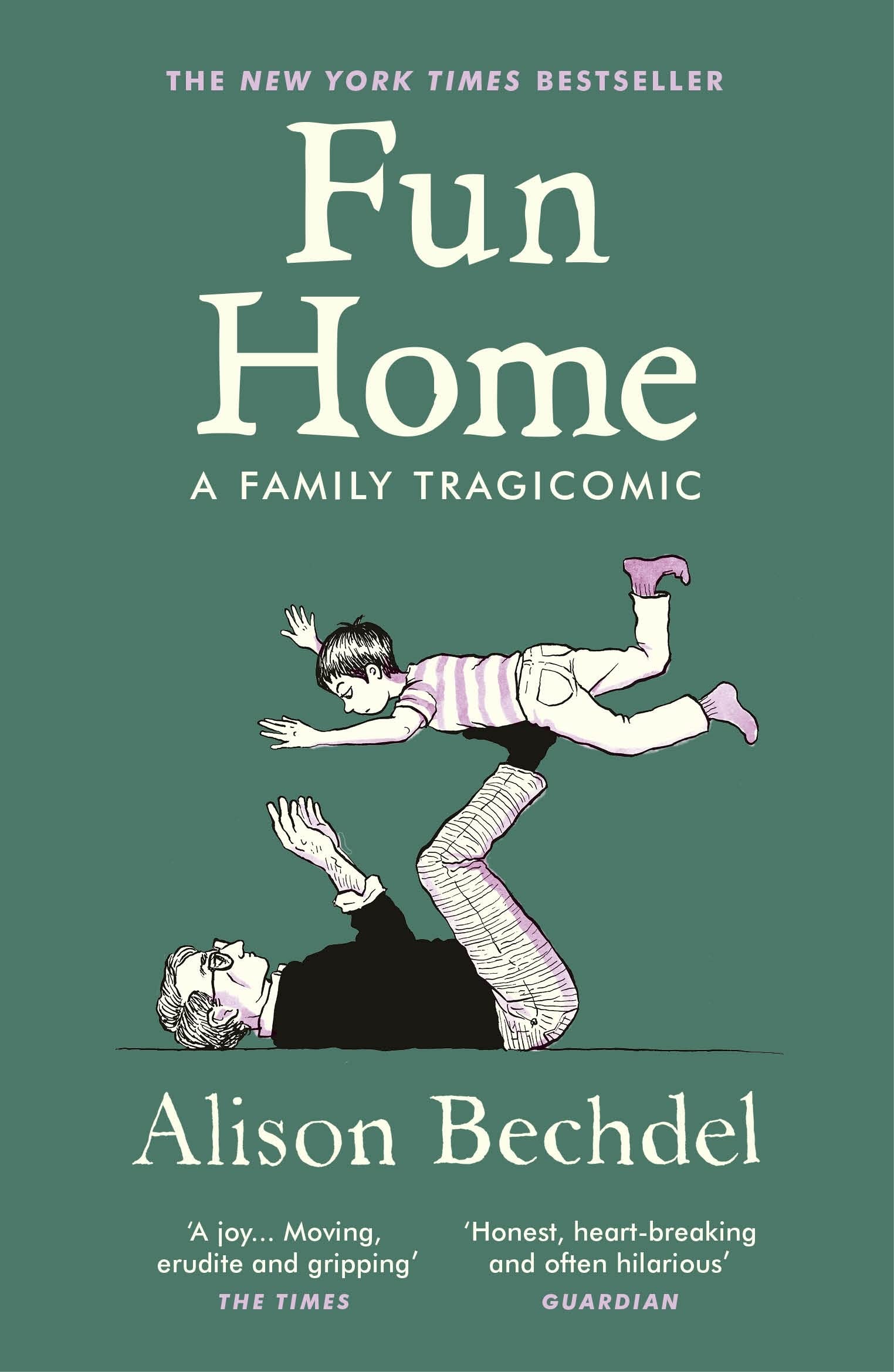
Alison Bechdel

The Bechdel Test
Measures female representation in film:
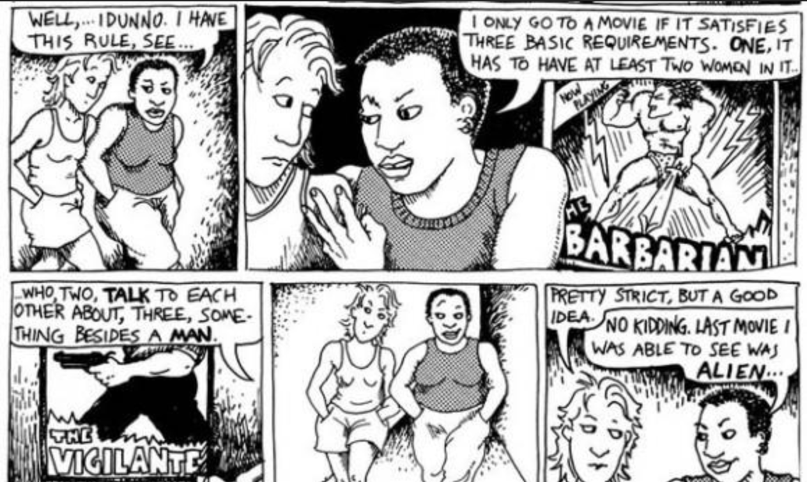 (Dykes to Watch Out For - 1985)
Film passes if…
- two female characters;
- talk to each other;
- about something besides a man.
Go to your container
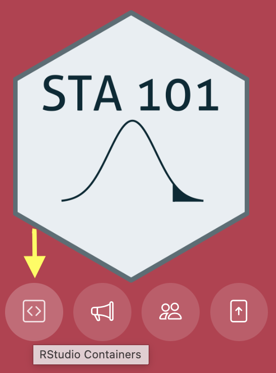
- Visit the Duke Container Manager (and log in with your NetID);
- (If you haven’t already, reserve the STA101 container on the right-hand-side)
- Click STA101 under “My reservations” on the left-hand side;
- Login, start, and give it a sec to launch in your browser.
Grab today’s files
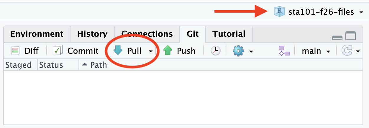
- Double-check that you have the course project loaded in the upper right corner;
- Go to the Git tab in the upper right pane and click Pull.
Can we reproduce this claim?
From FiveThirtyEight

“We did a statistical analysis of films to test two claims: first, that films that pass the Bechdel test — featuring women in stronger roles — see a lower return on investment, and second, that they see lower gross profits. We found no evidence to support either claim.”
Plotting a histogram
Start with a blank canvas:

Plotting a histogram
What variables are we looking at?
The aesthetic mapping is where we tell the computer what variables in the data frame we want to use and how we want to use them.
Plotting a histogram
What kind of plot for this numerical variable:
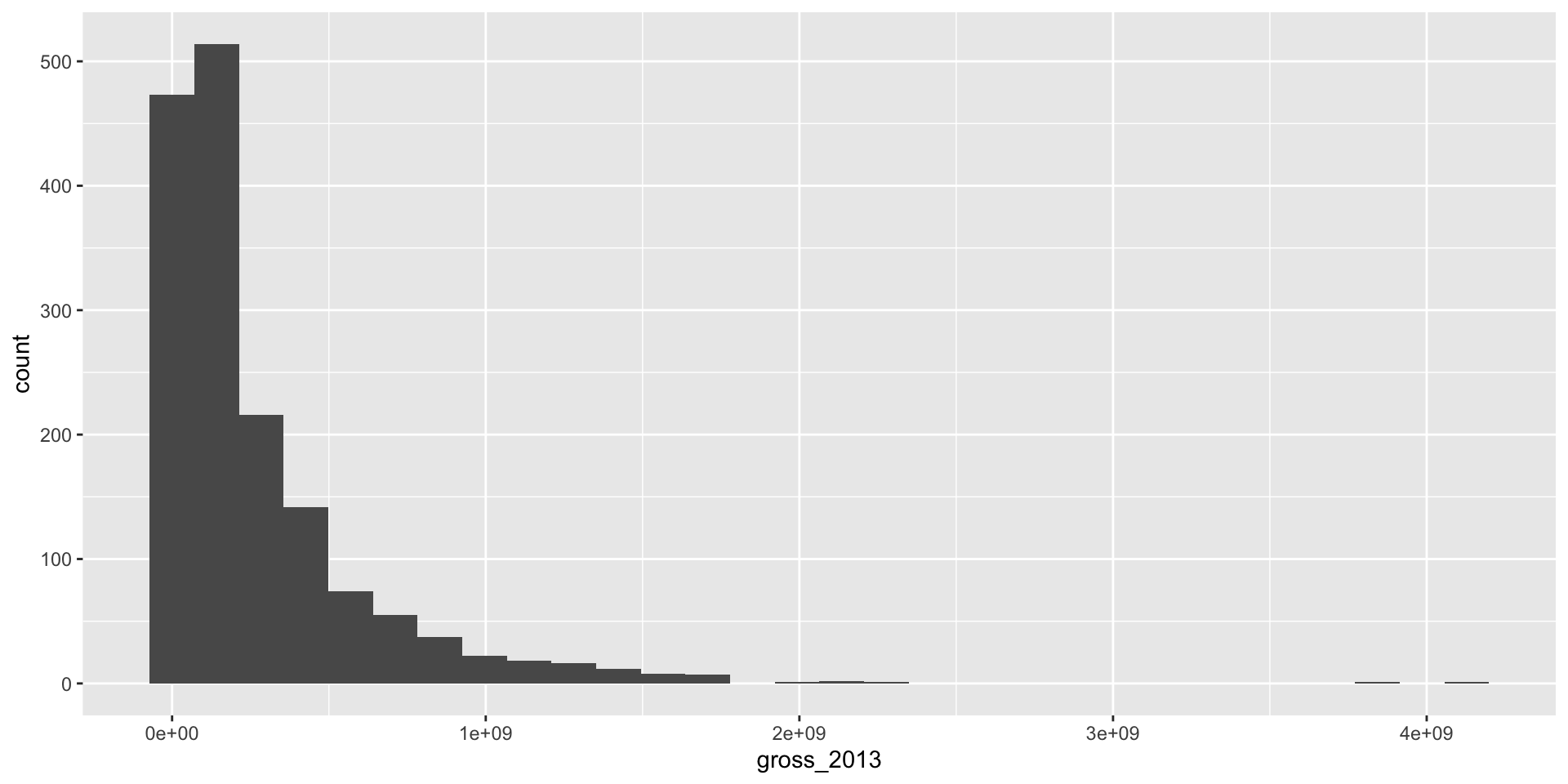
Plotting a histogram
Add labels:
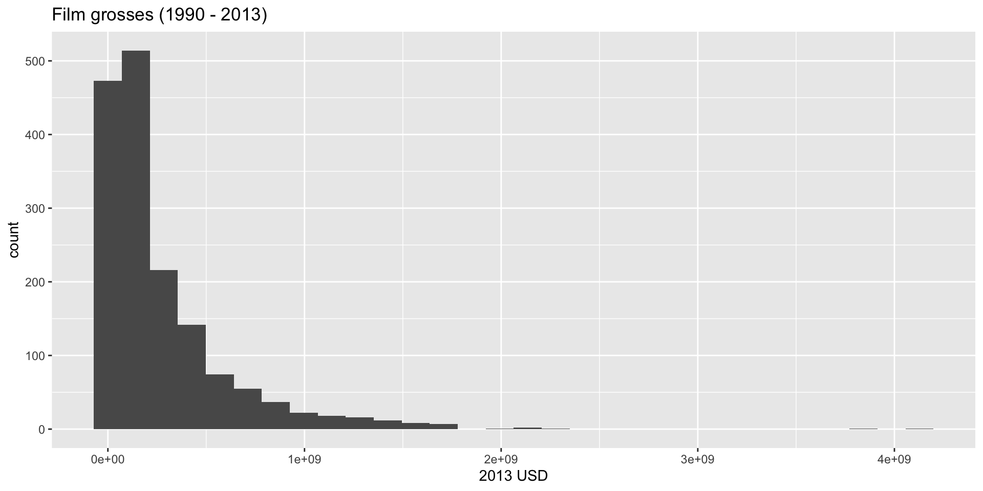
Y’know…so we know what we’re looking at!
Plotting a histogram
Increase font size and give it a minimalist look:
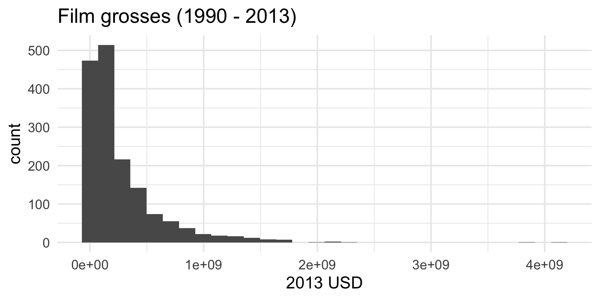
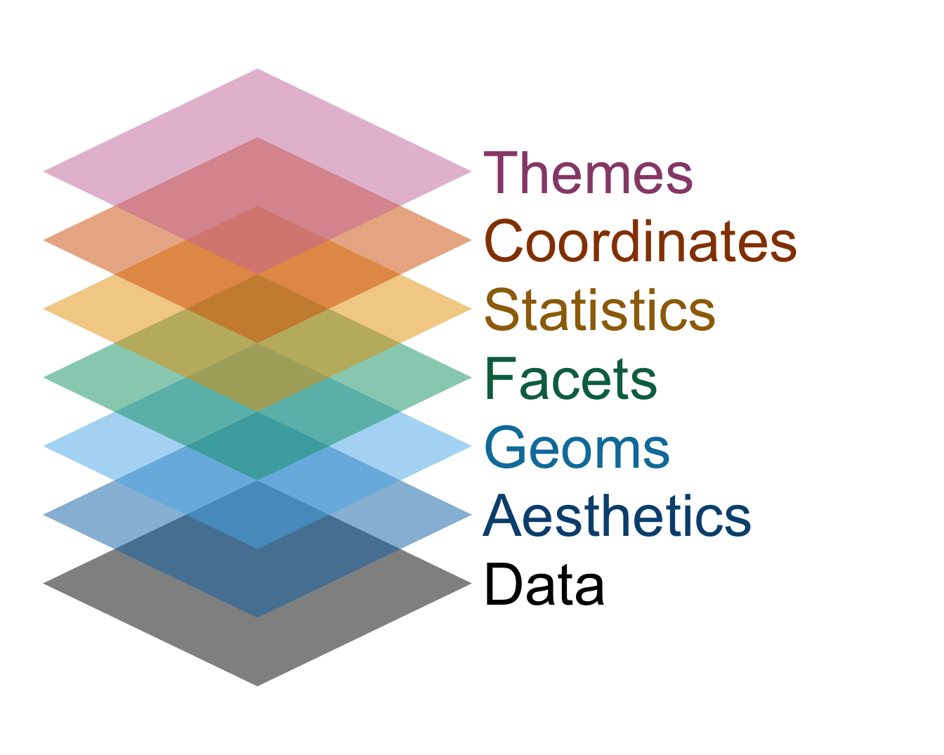
Dataviz with ggplot is like building a cake

- Every plot element is a new layer, and you stack ’em up;
- If the different commands are like the layers of sponge, then the plus signs in between are like the icing. Don’t forget the icing!
The grammar of graphics
This design philosophy is described in the book The Grammar of Graphics and implemented in the ggplot2 package.
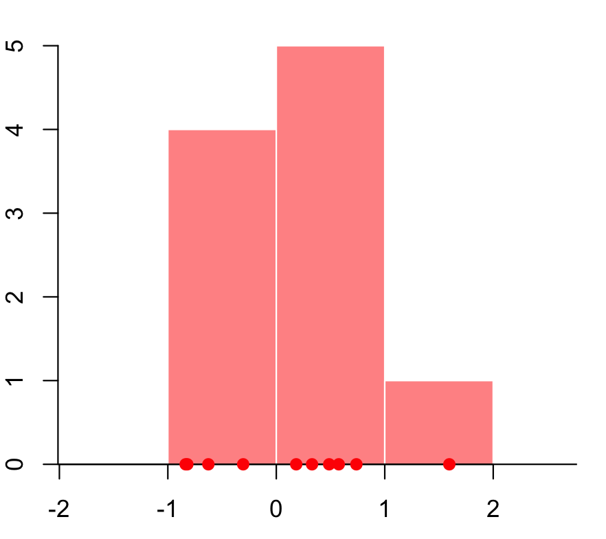
How is a histogram drawn?
- Start with the number line (horizontal axis);
How is a histogram drawn?
- Start with the number line (horizontal axis);
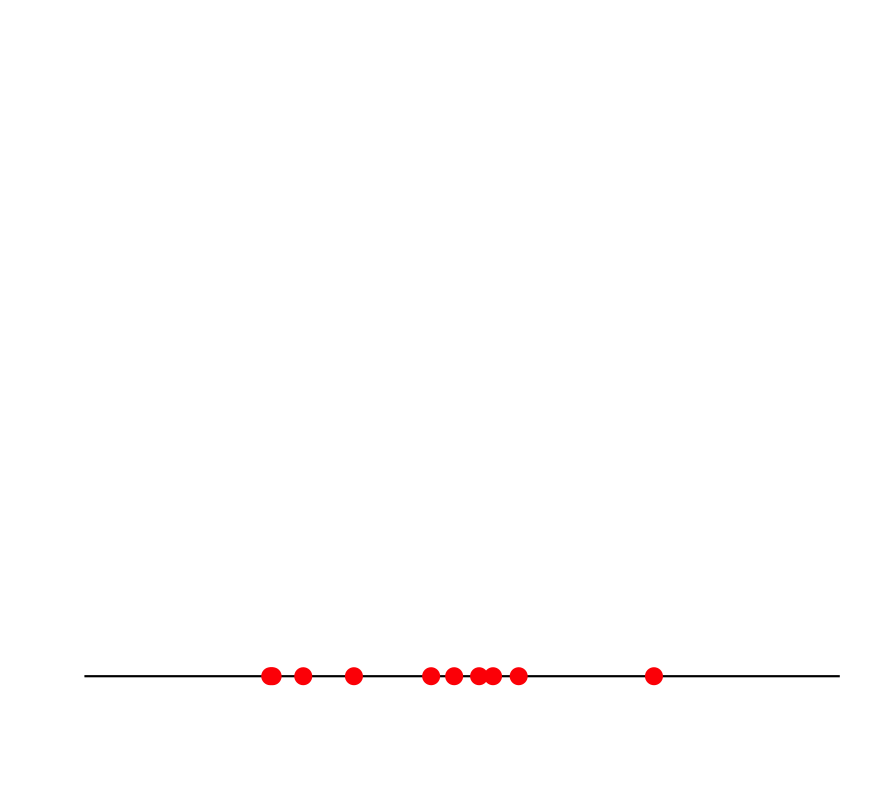
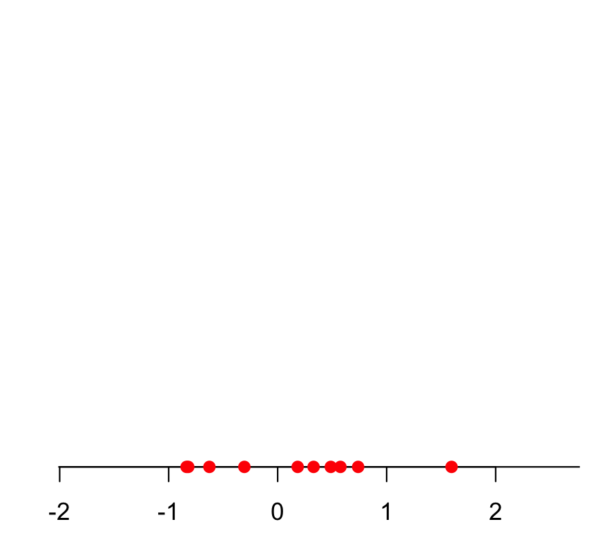
- Put your data values on the line;
How is a histogram drawn?
- Start with the number line (horizontal axis);
- Put your data values on the line;
- Break the line into bins;
How is a histogram drawn?
- Start with the number line (horizontal axis);
- Put your data values on the line;
- Break the line into bins;
- Count how many data values fall in each bin;
How is a histogram drawn?
- Start with the number line (horizontal axis);
- Put your data values on the line;
- Break the line into bins;
- Count how many data values fall in each bin;
- Put bars over the bins (height = count).
Choice: how do you draw the bins? How many? How wide?
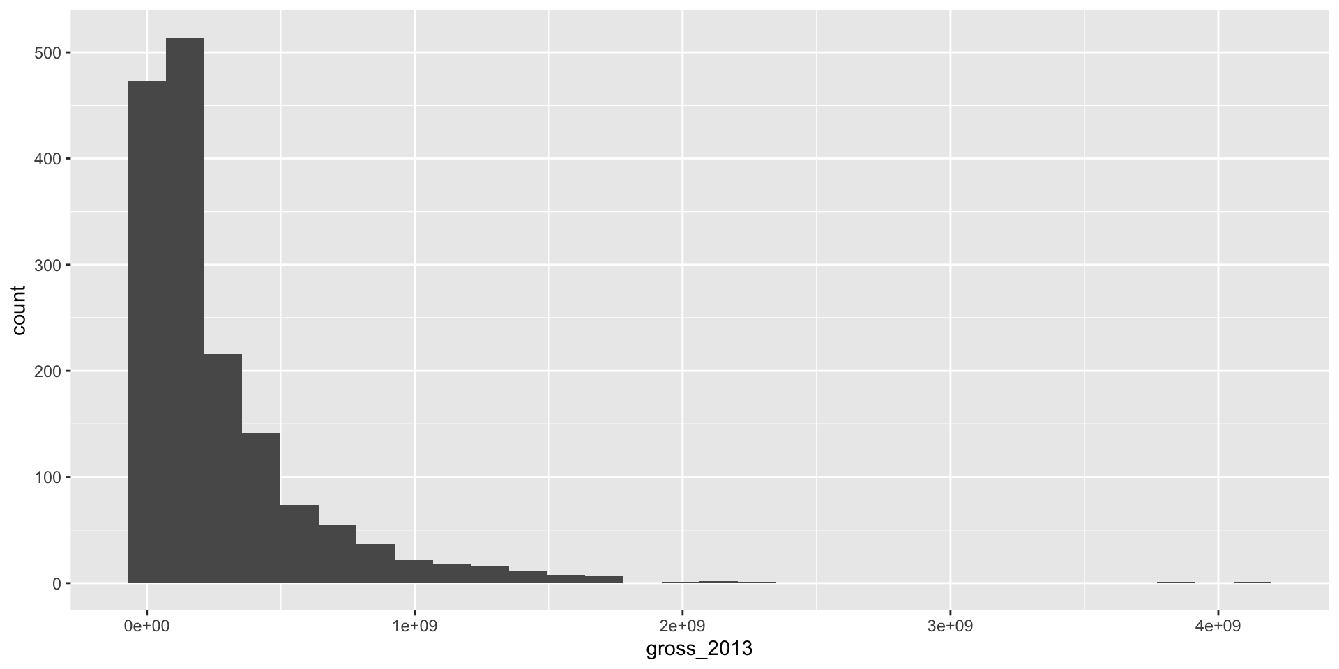
Back to Bechdel
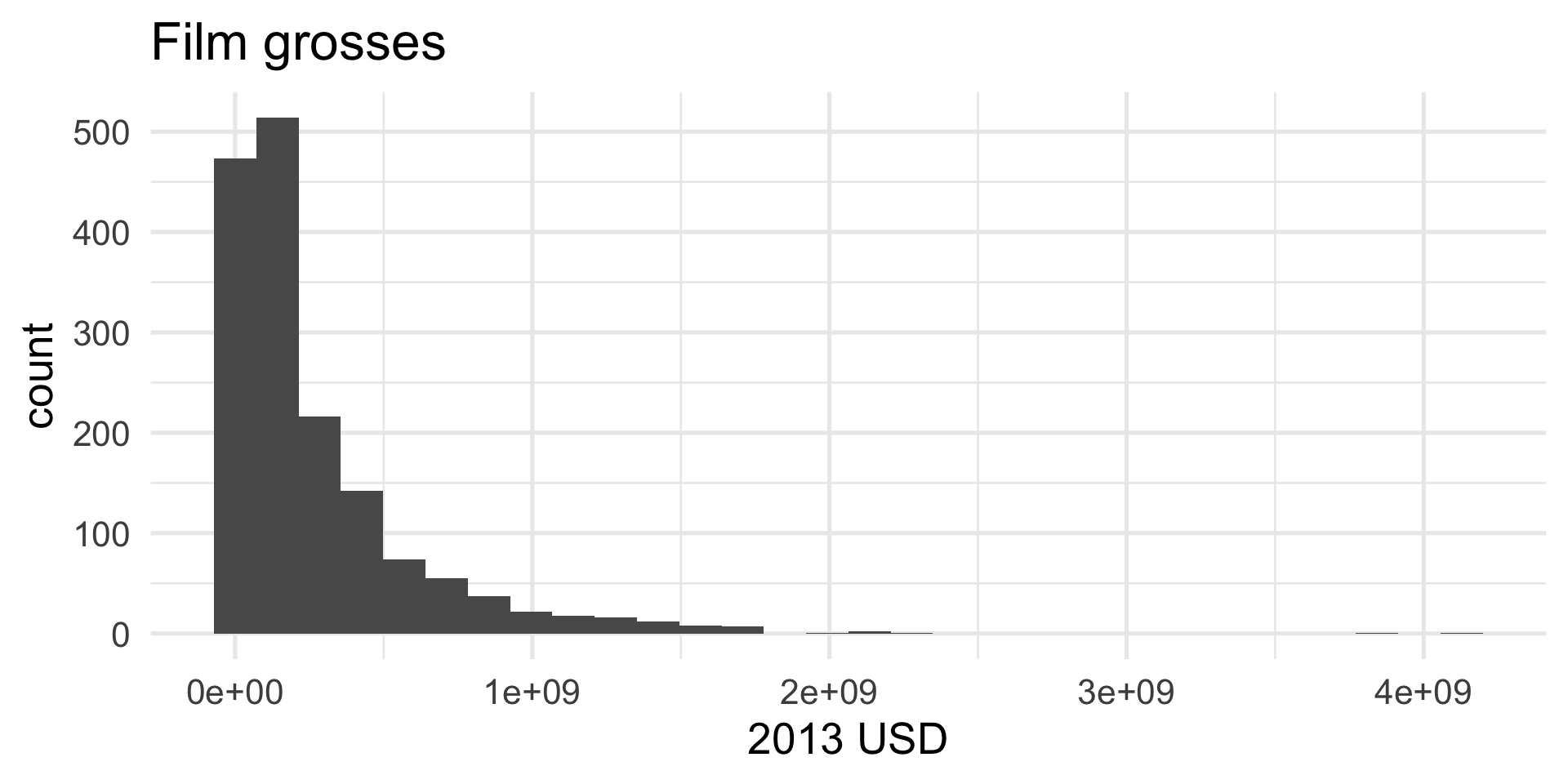
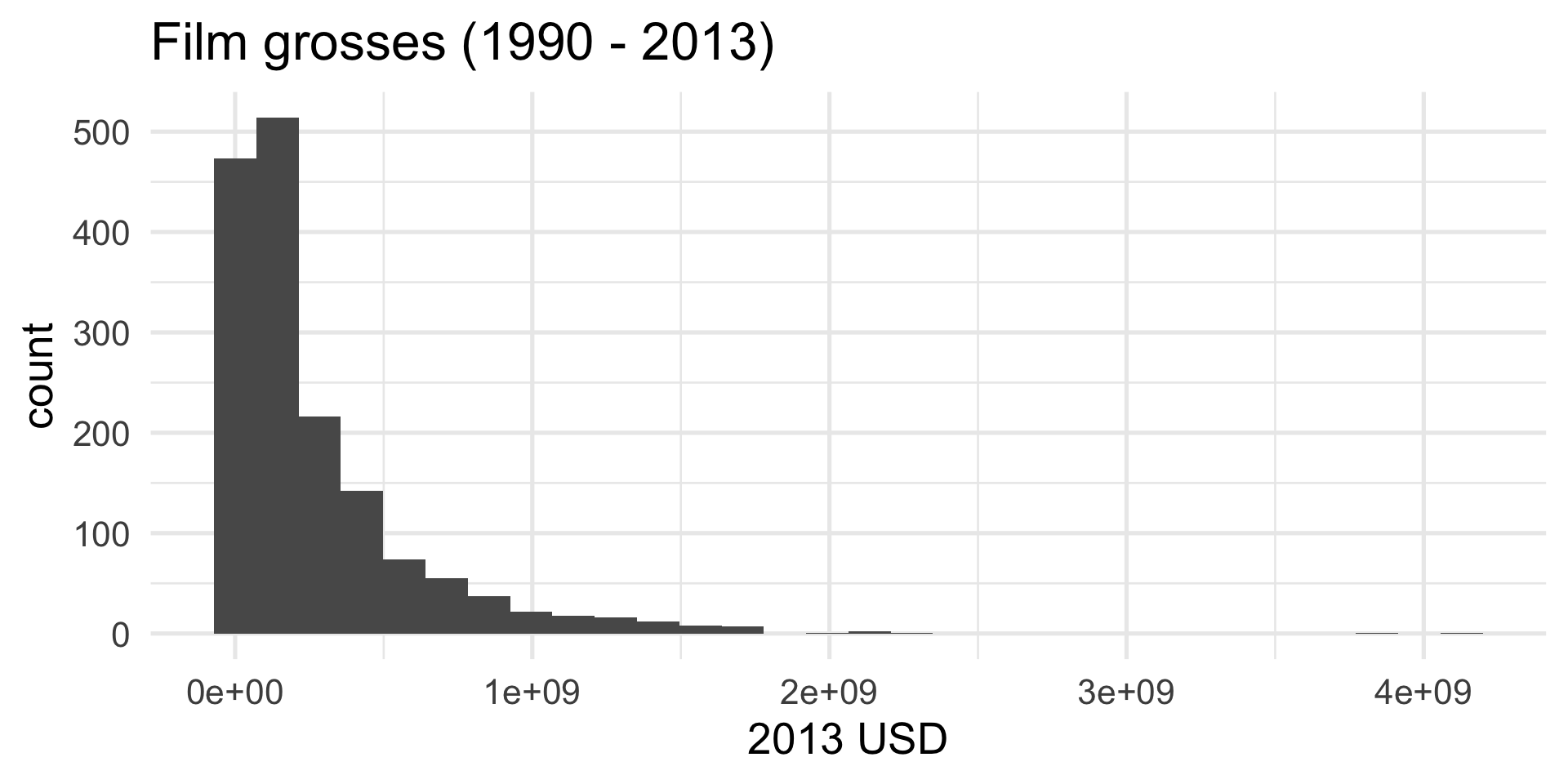
R makes a default choice about the number/width of bins:
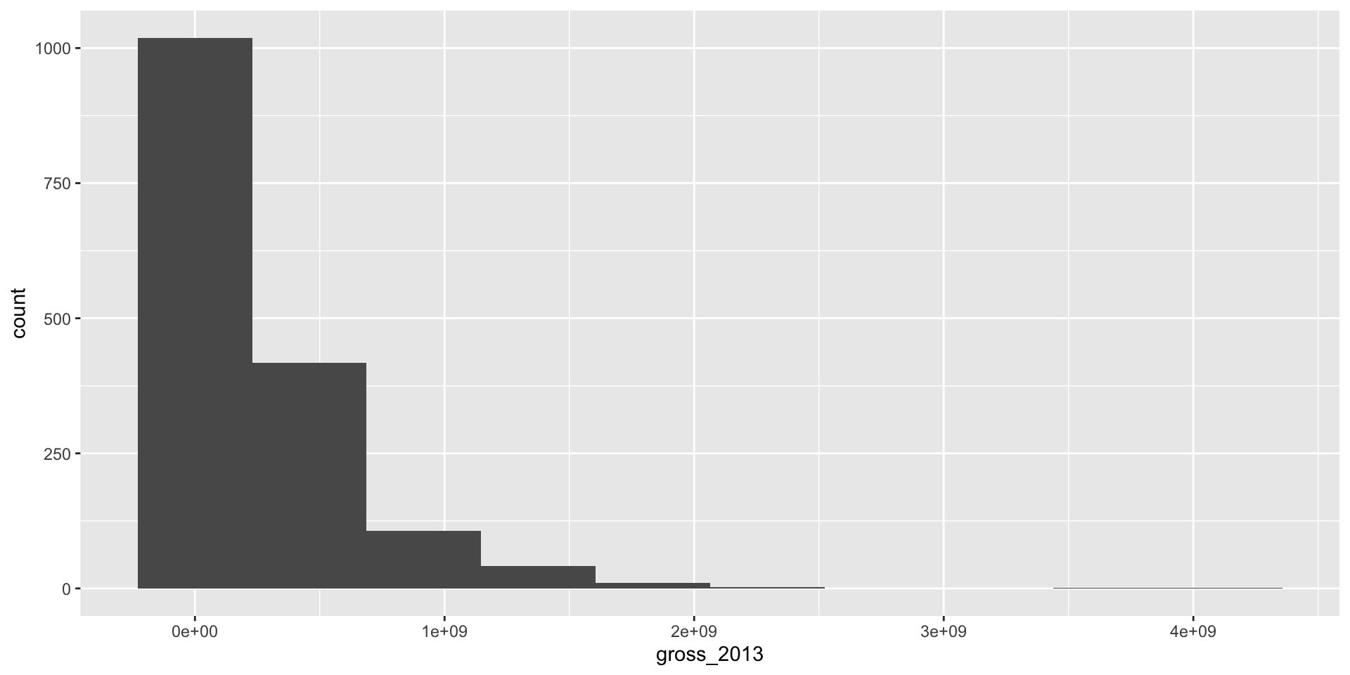
You can override the default
Fewer, wider bins:
You can override the default
Many, thinner bins:
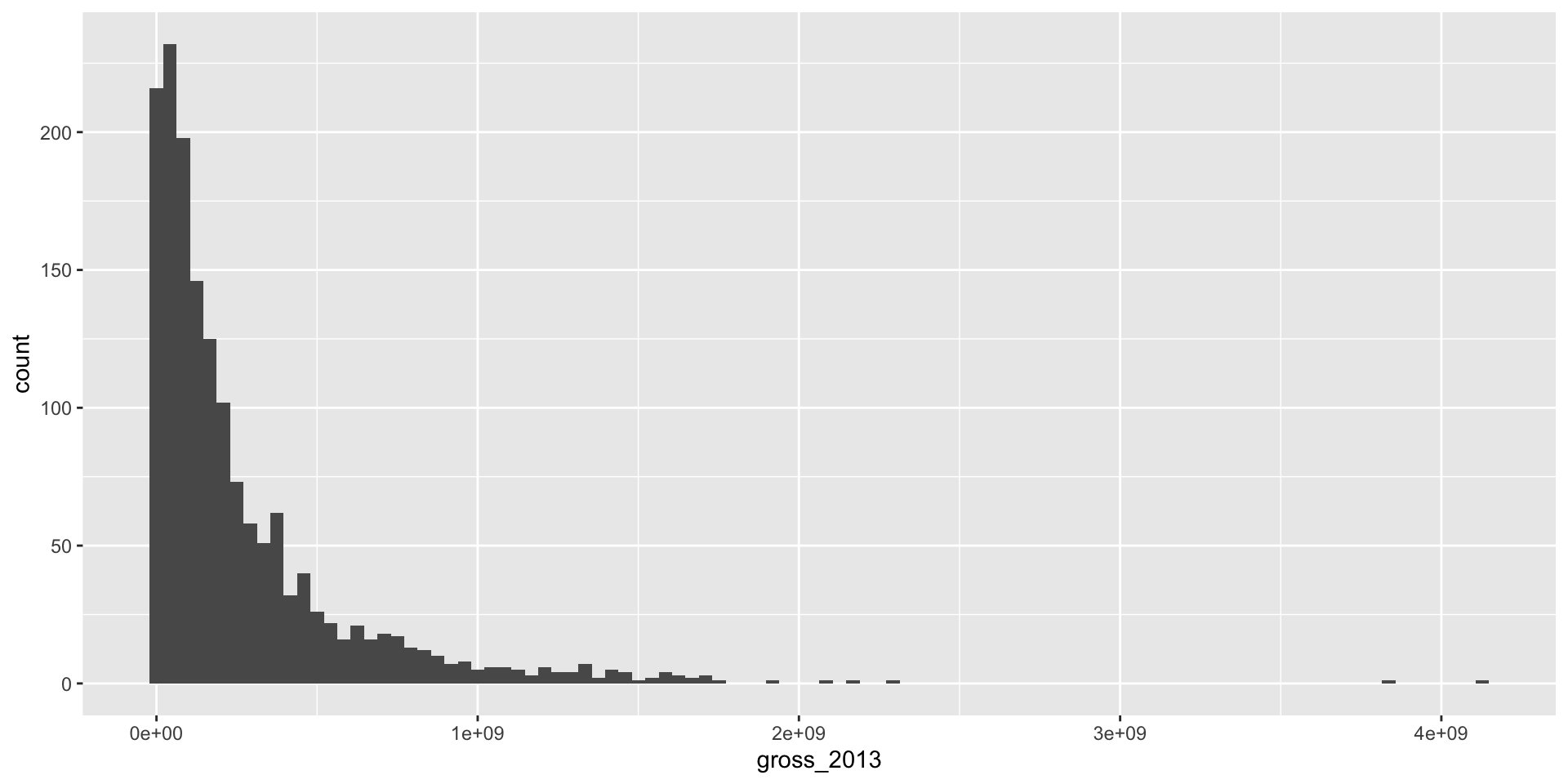
You can go too far either way
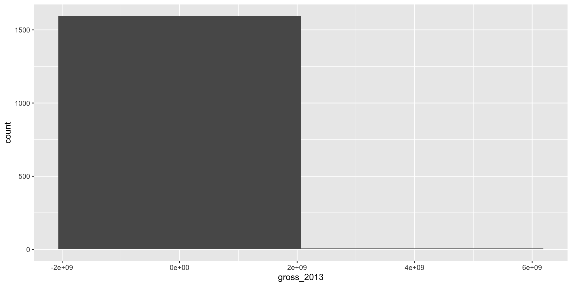
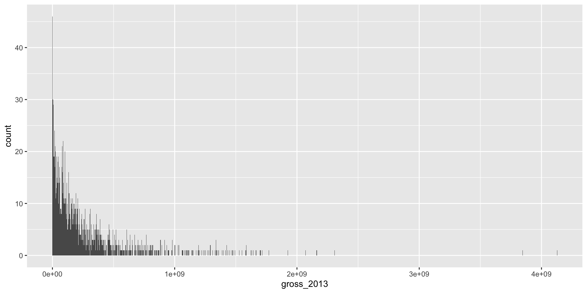
Part of the art here is developing an eye for what looks good.
Another option: instead of a histogram
Another option: a density
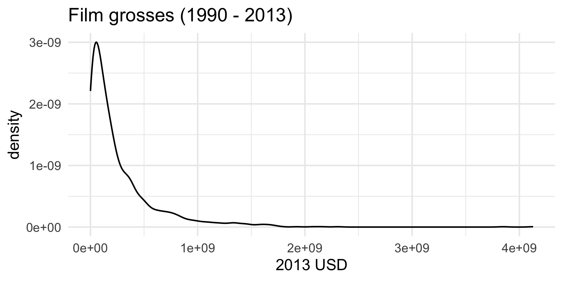
Compare
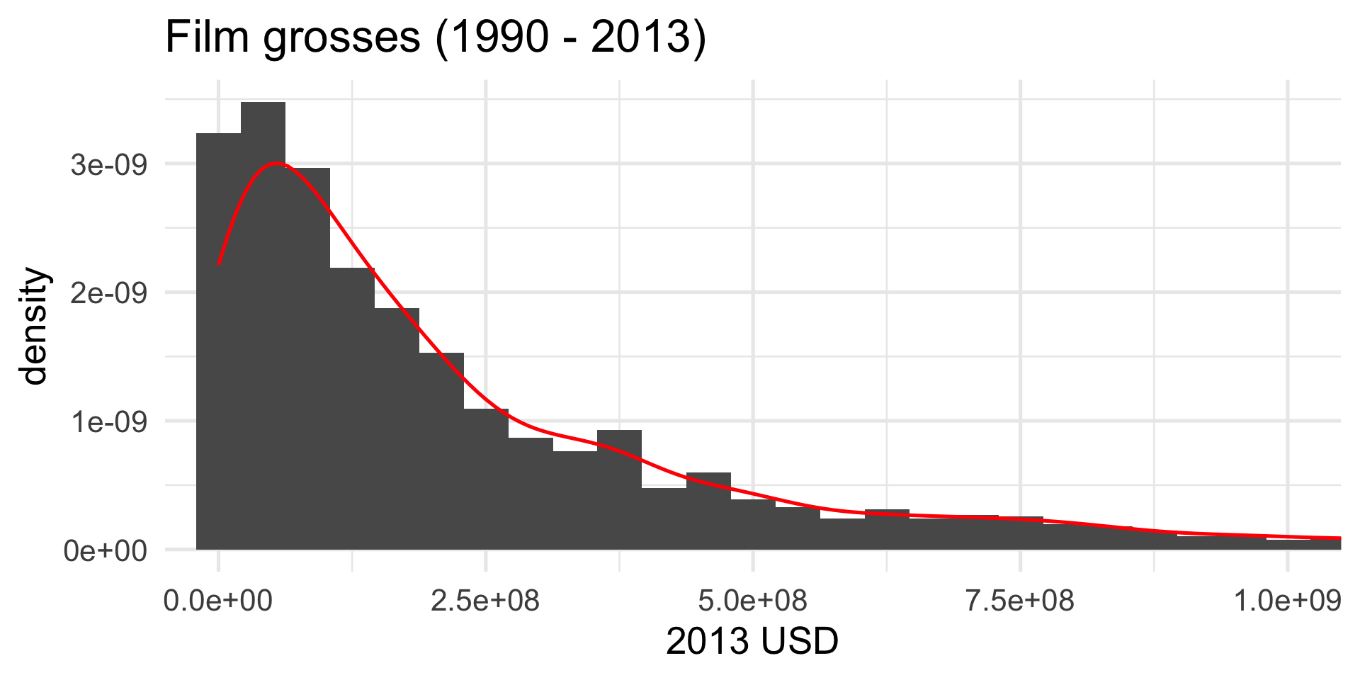
Prettier. Smooths out the lumps and bumps. There are still defaults you could learn to override.
But let’s make it nice
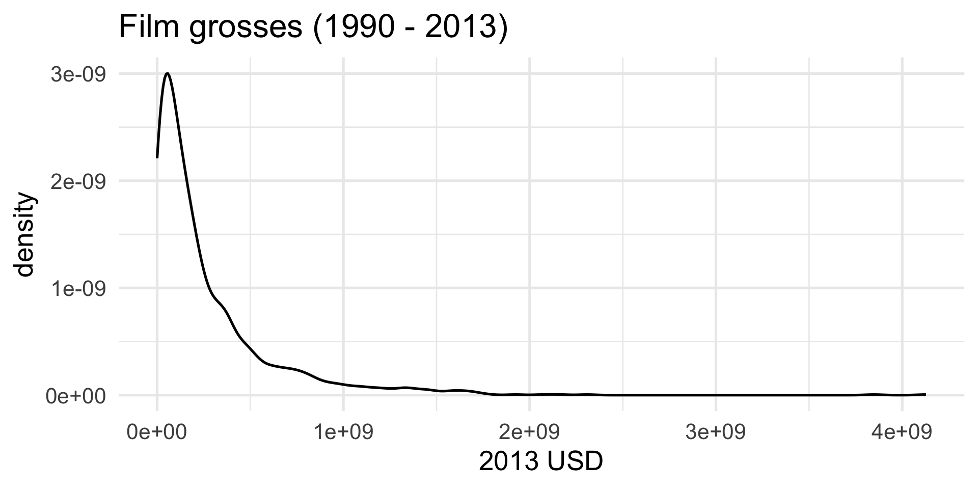
What we have so far:
But let’s make it nice
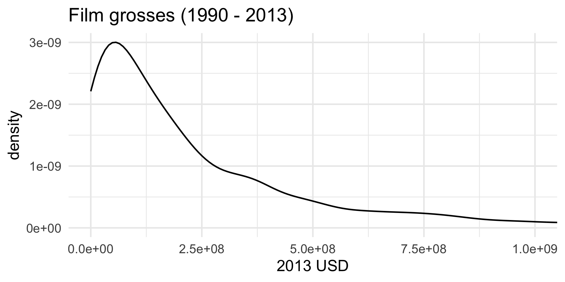
We don’t need to see everything, do we?
But let’s make it nice
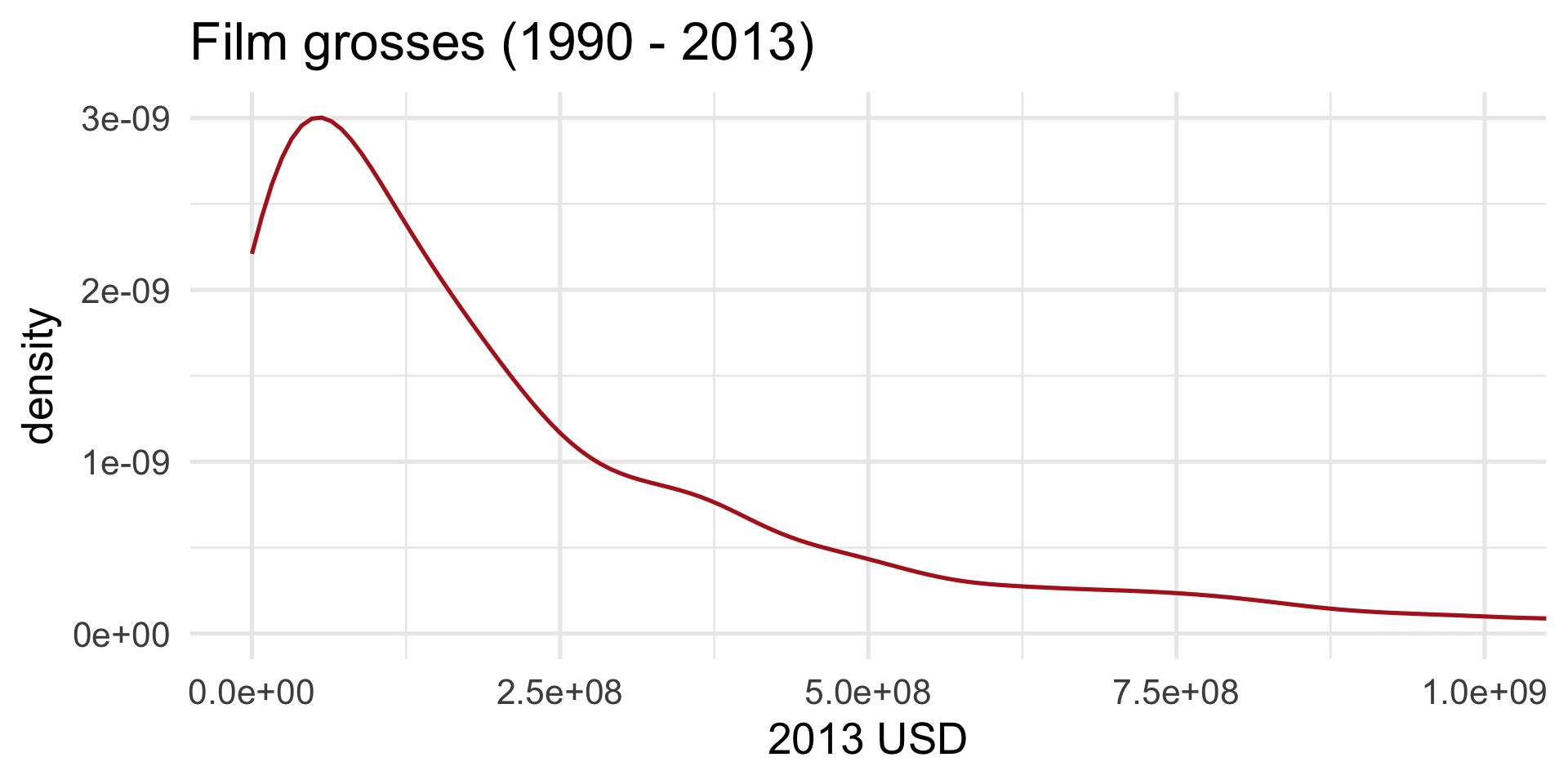
A pop of color:
But let’s make it nice
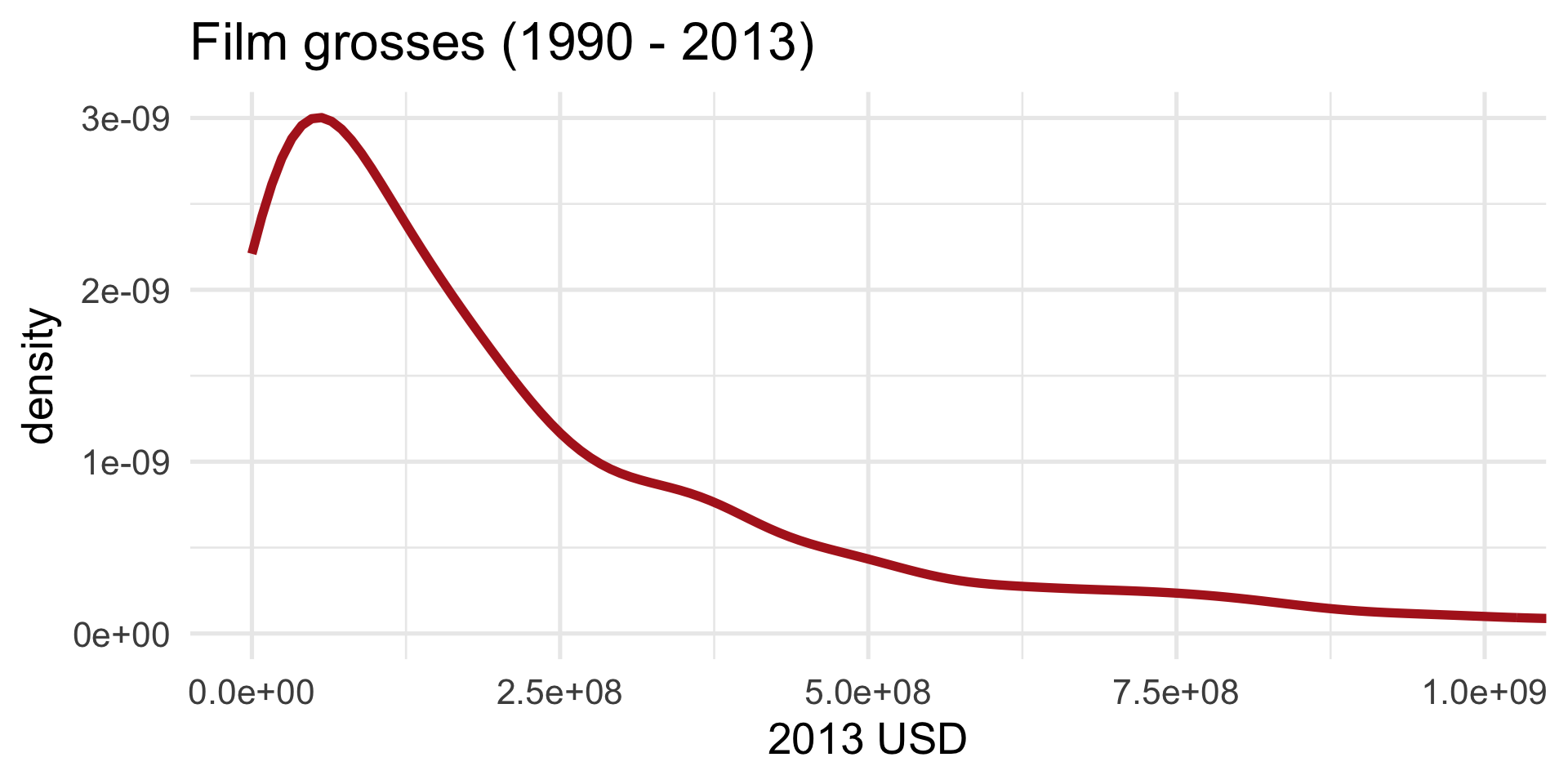
I can’t hear you:
But let’s make it nice
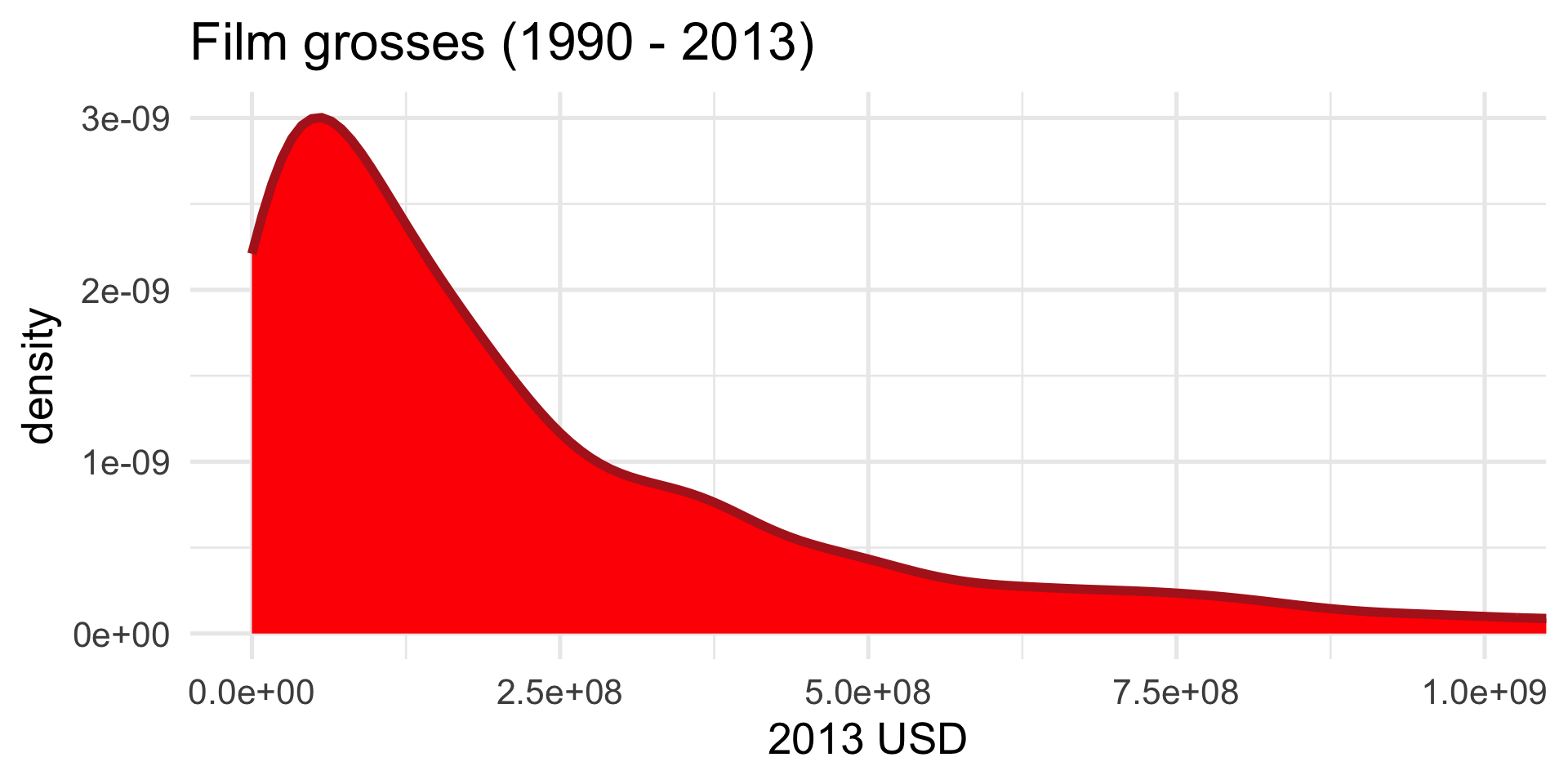
Give it some body:
But let’s make it nice
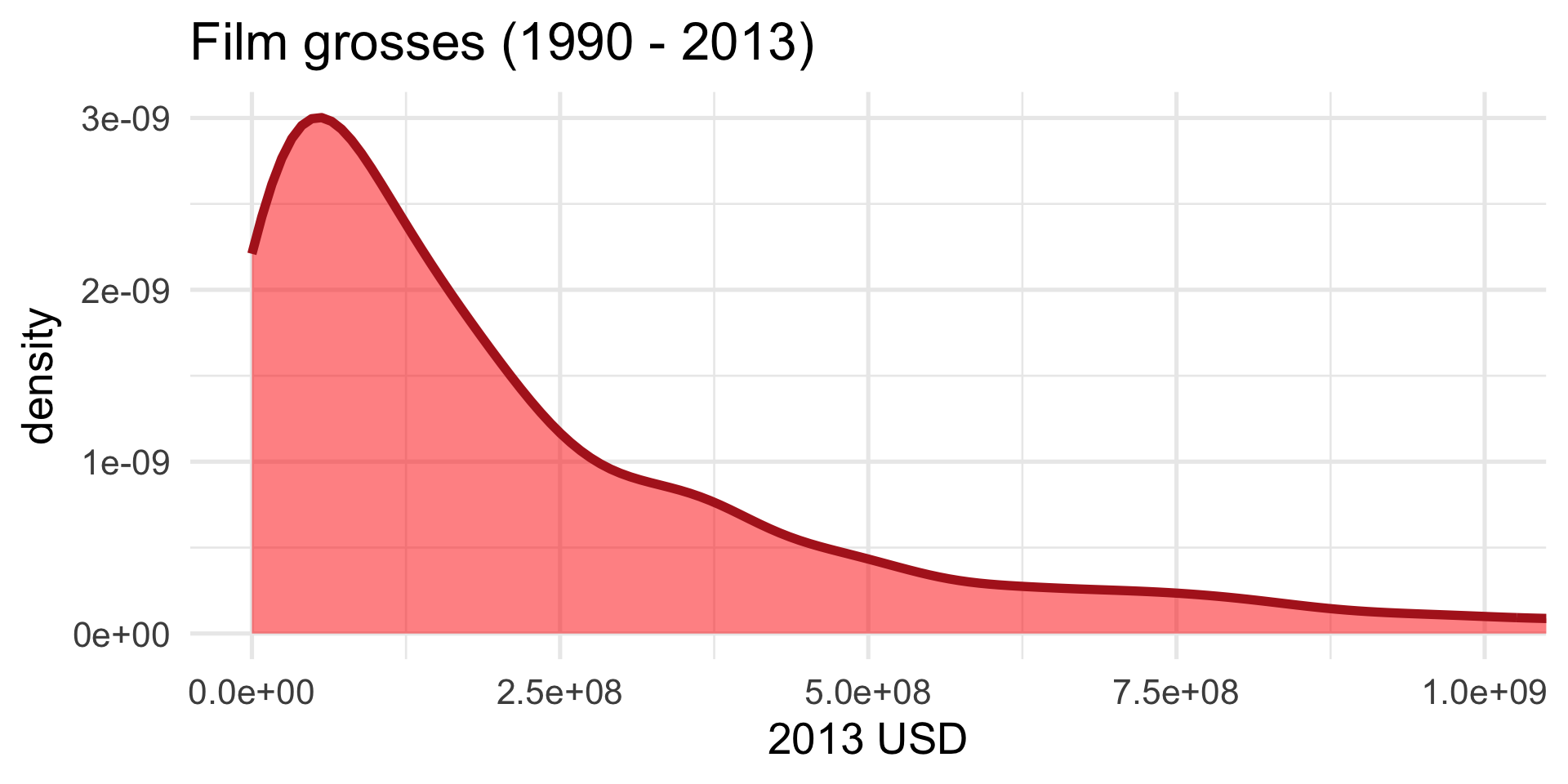
Too aggressive:
Yet another option: instead of a histogram
Yet another option: a boxplot
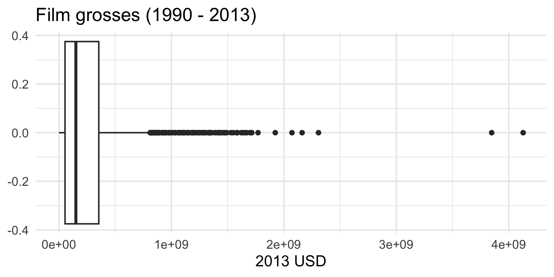
How is a box plot drawn?
The middle of the box is the median. 50% of the data are below, and 50% are above:
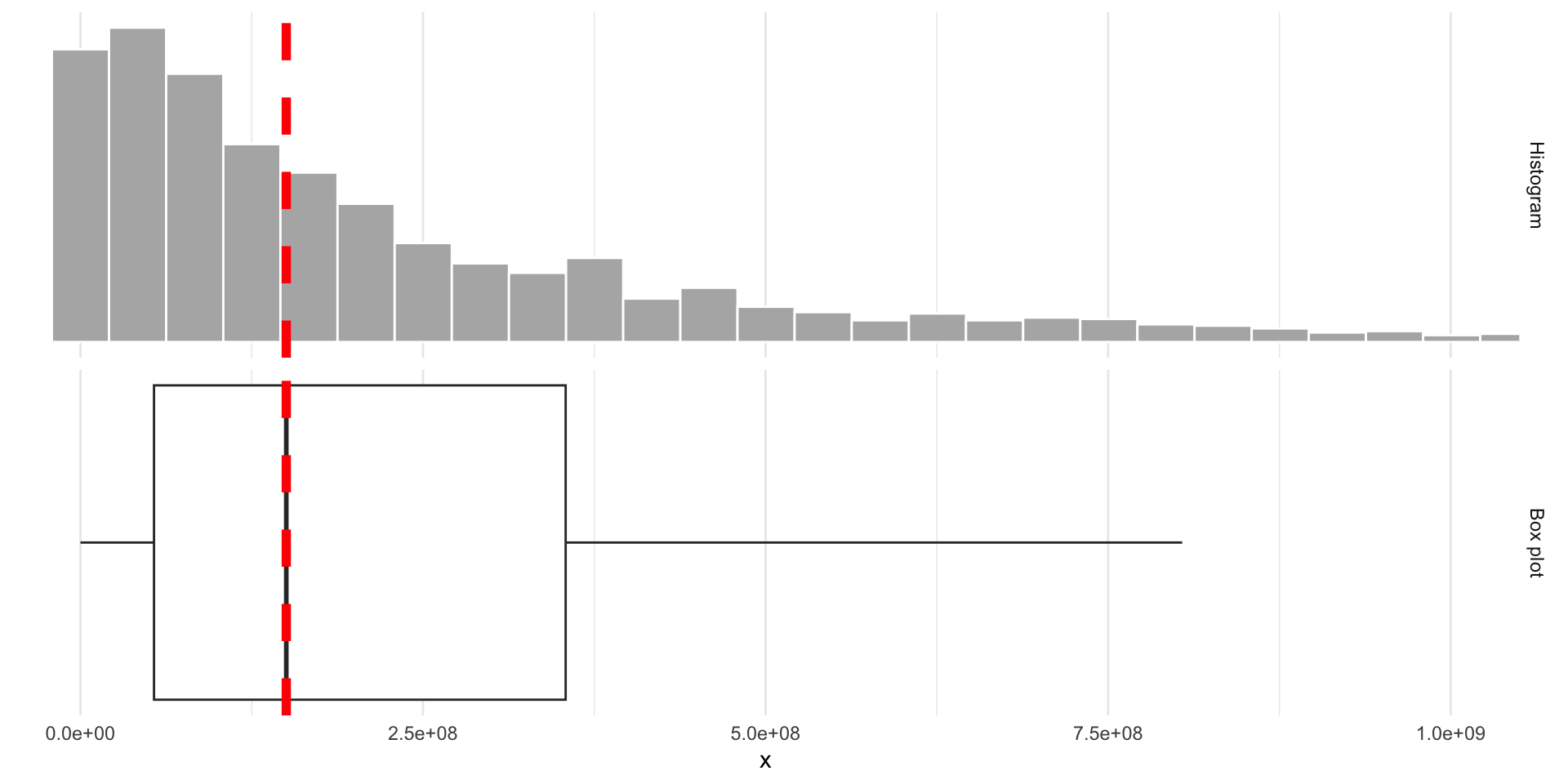
How is a box plot drawn?
The lower edge of the box is the 25% quantile. 25% of the data are below, and 75% are above:
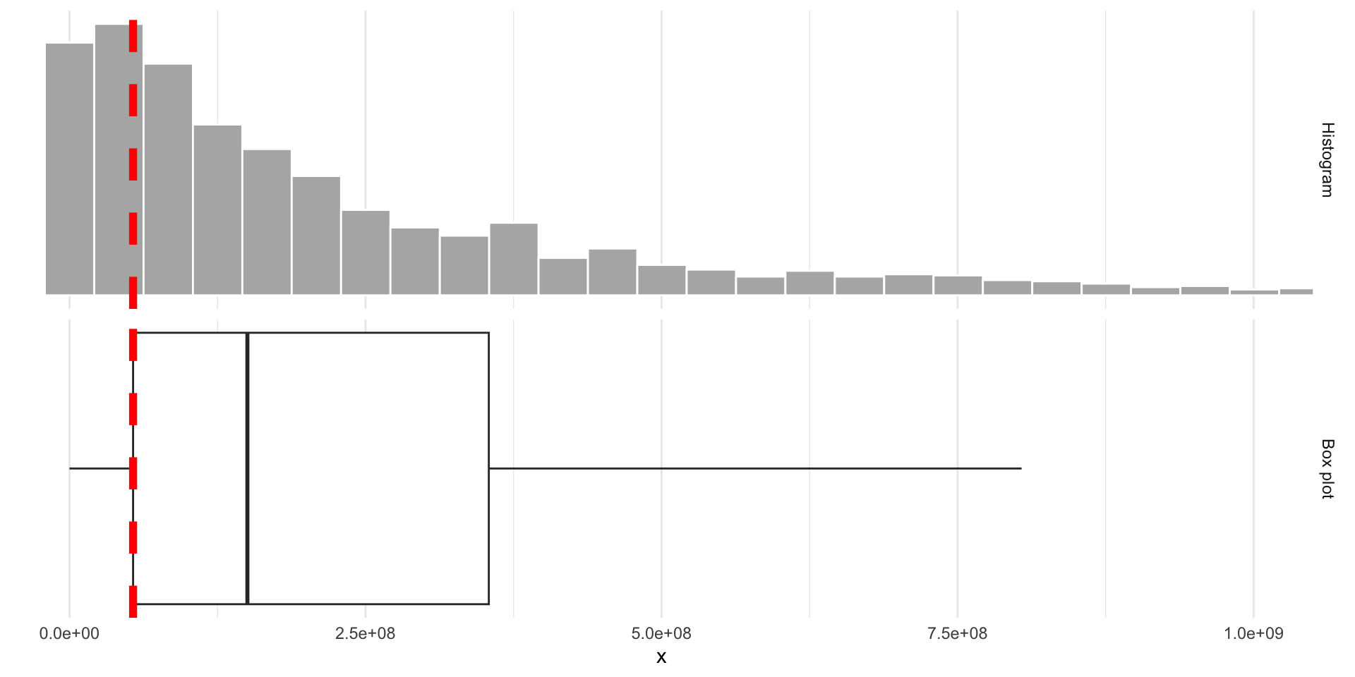
How is a box plot drawn?
The upper edge of the box is the 75% quantile. 75% of the data are below, and 25% are above:
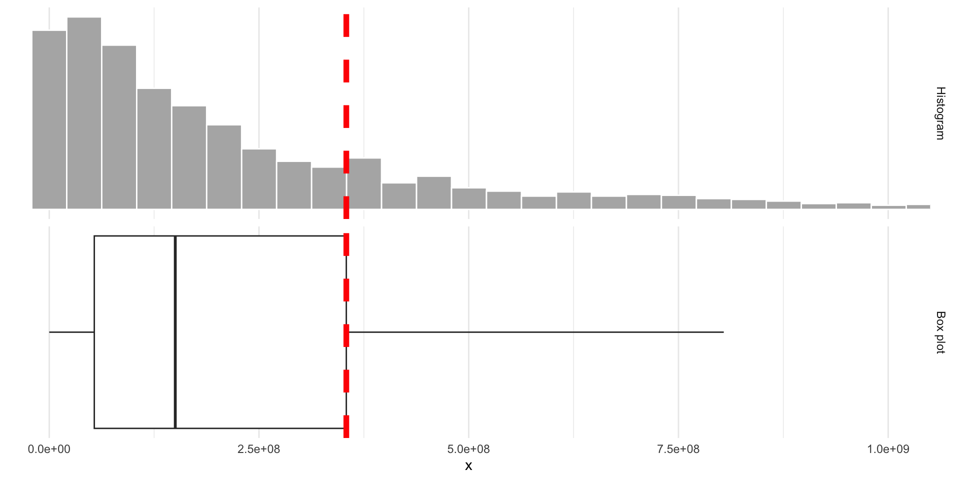
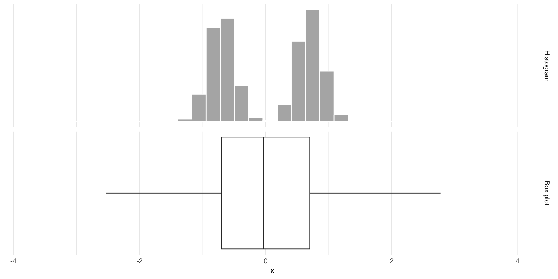
Box plots obscure modality
Same box plot:
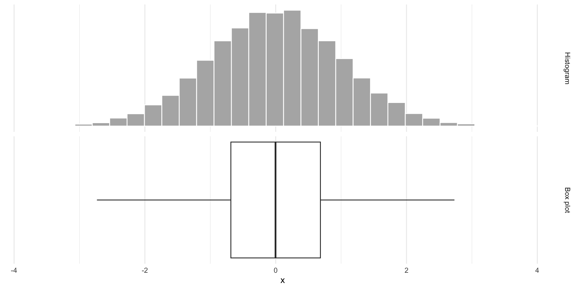
Box plots obscure modality
Very different distributions:
So…now what?
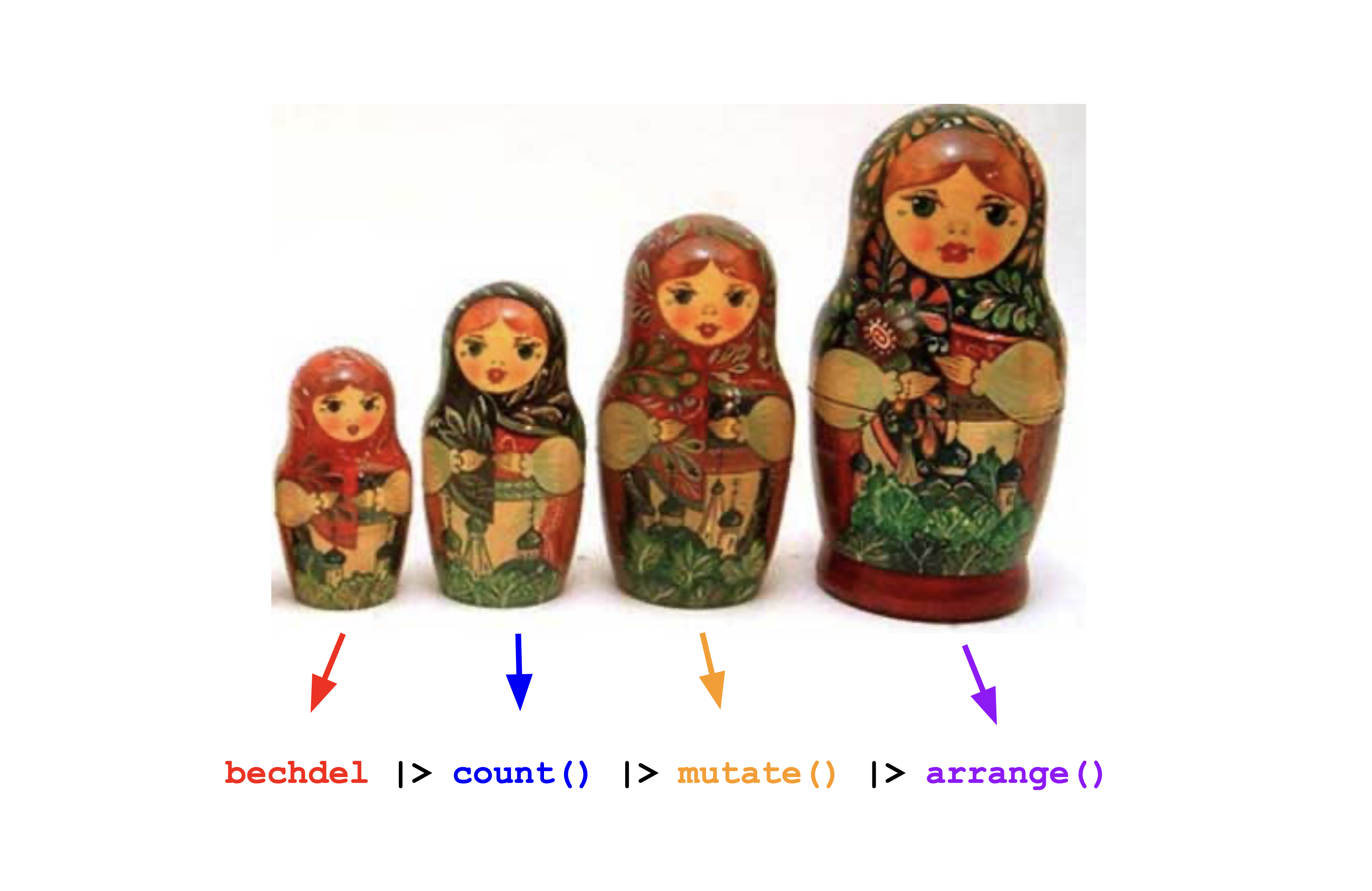
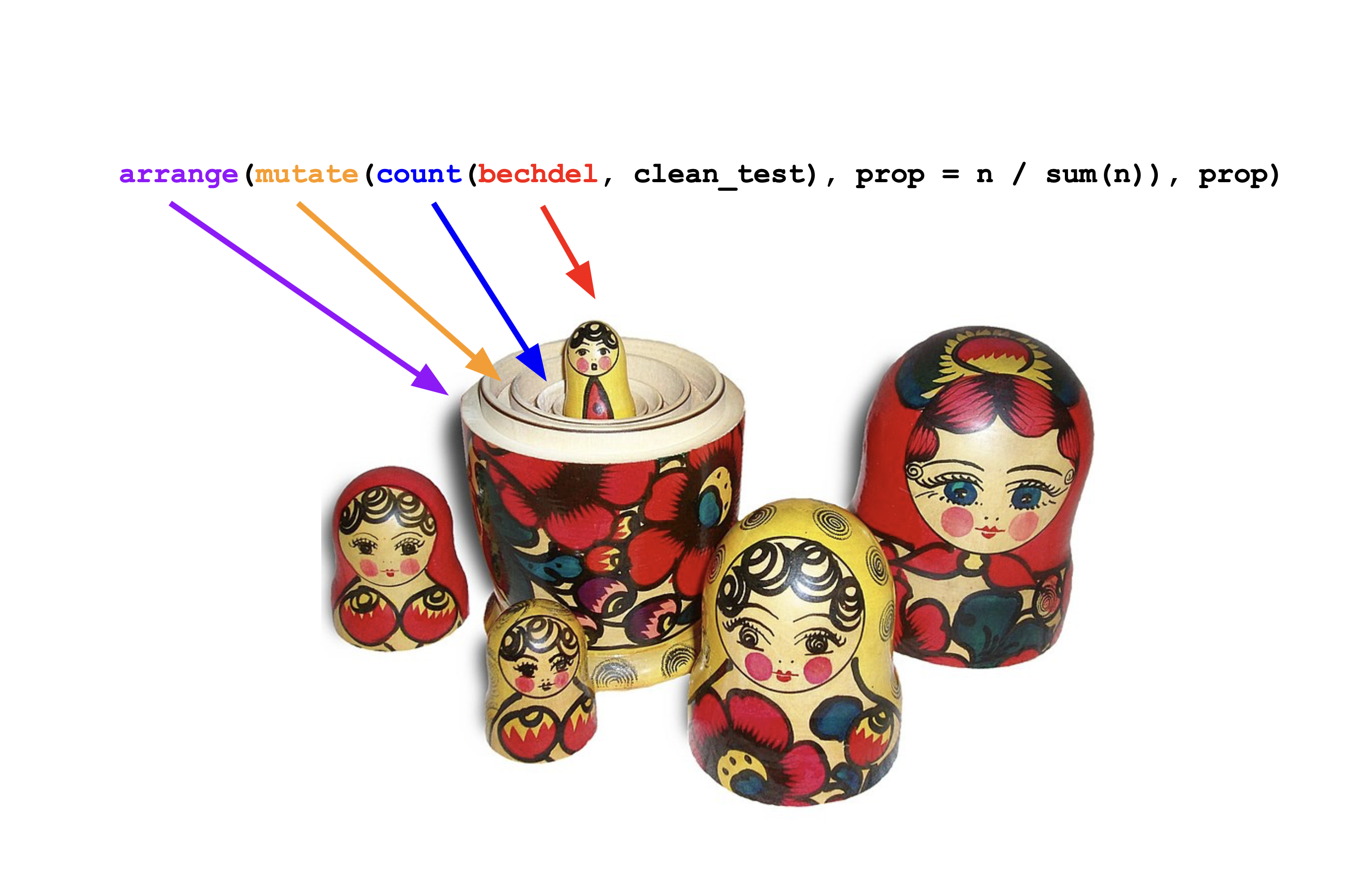
Like a Russian stacking doll
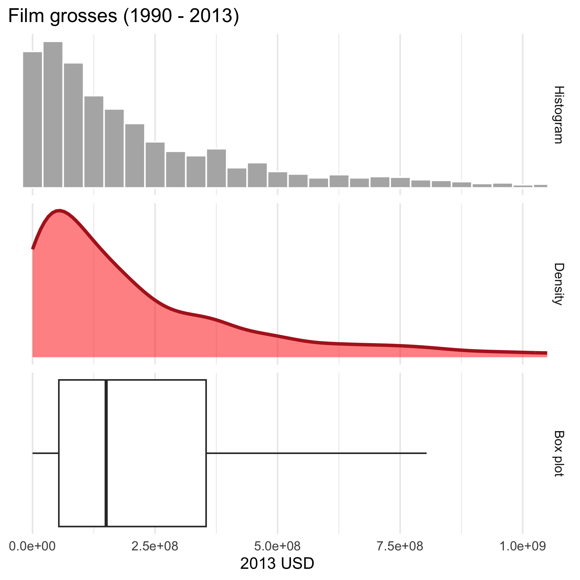
Numbers and pictures, working together
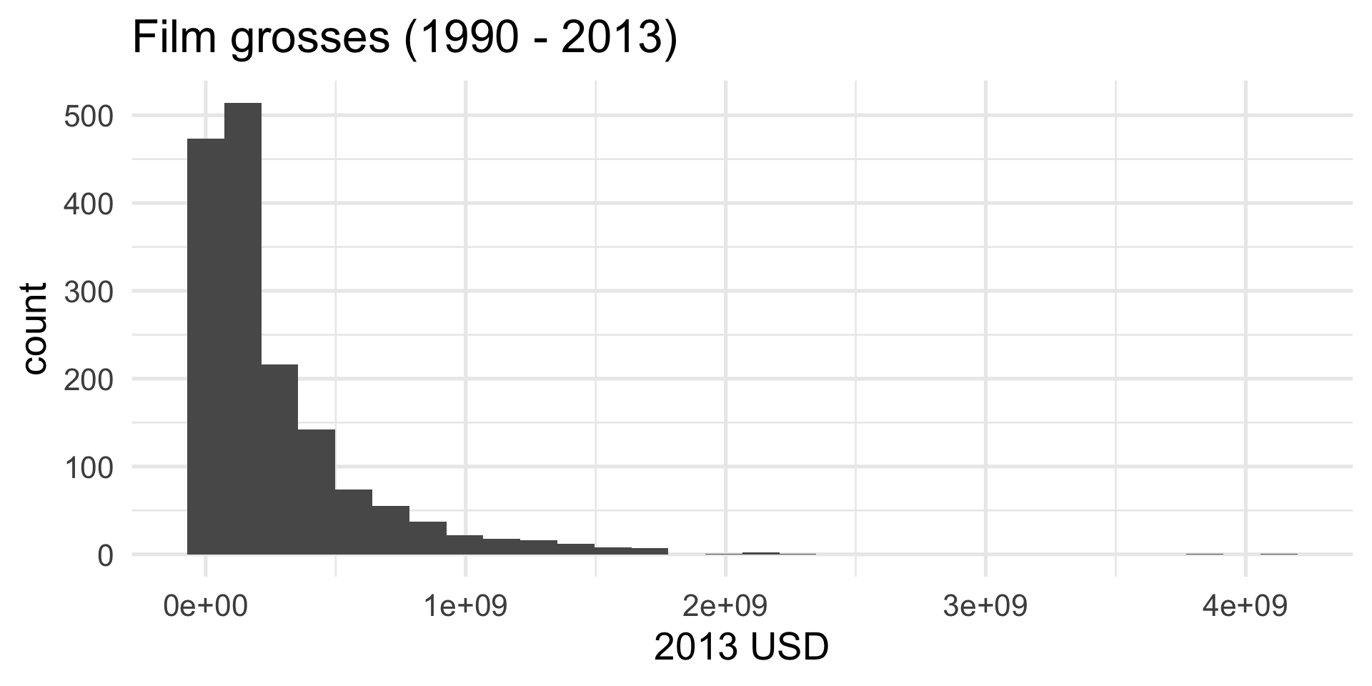
Where are the grosses concentrated?
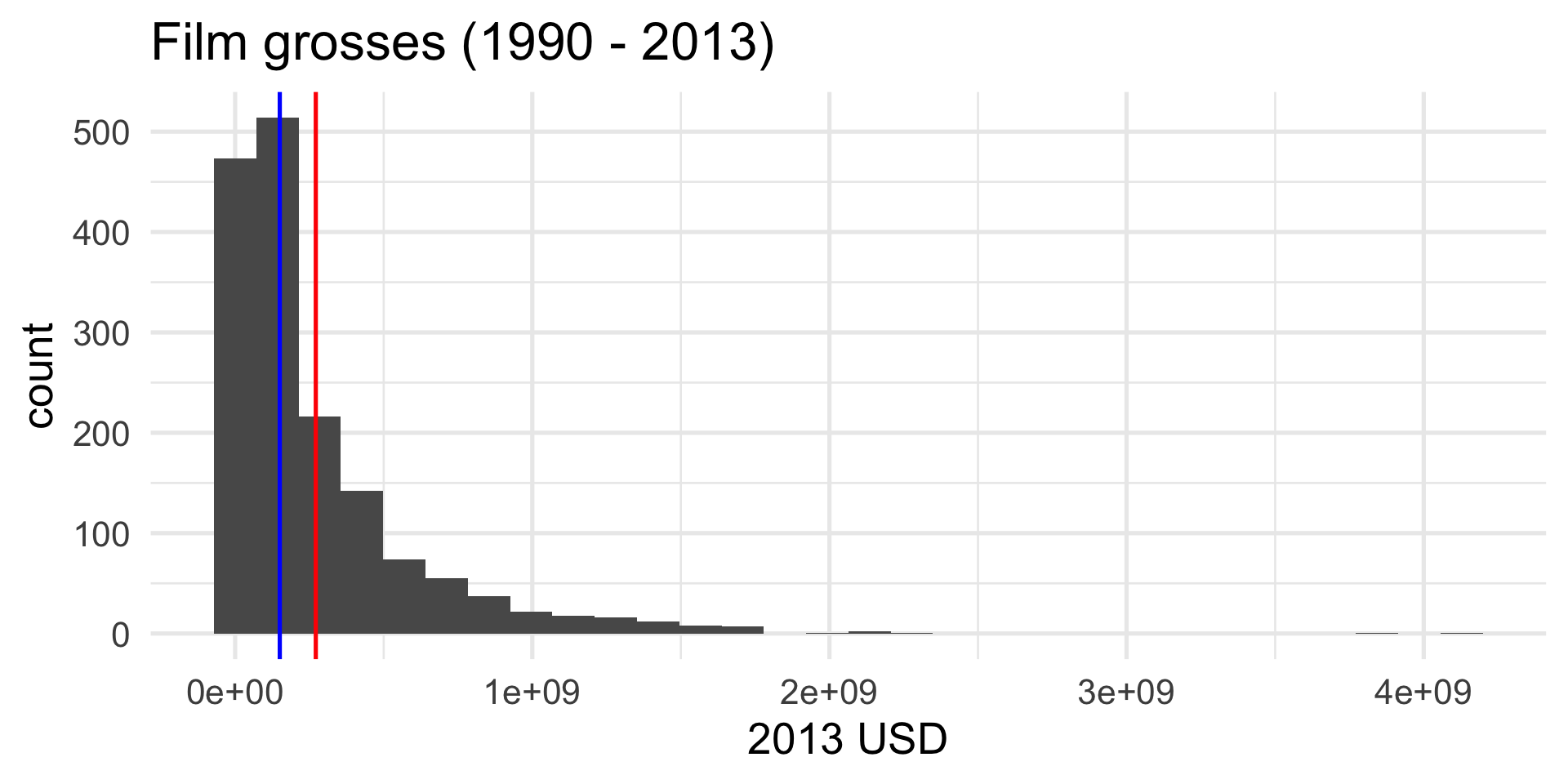
If there is only one peak, then…
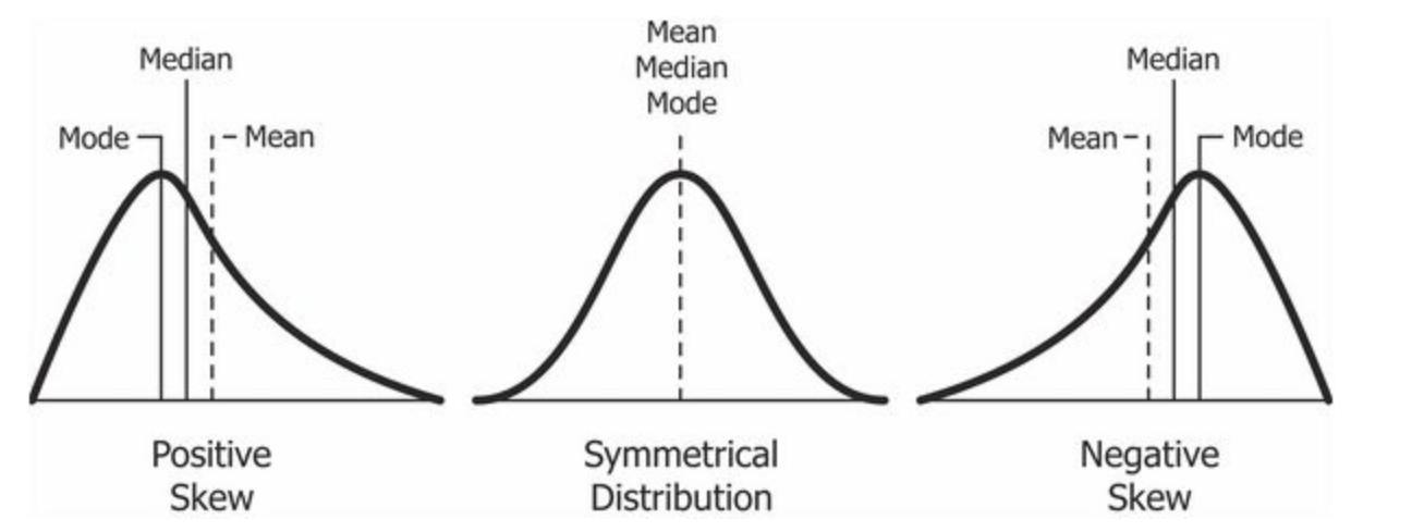
The mean is more sensitive to “outliers” than the median. The mean will get dragged in the direction of the skew more aggresively.
Summary
Visualizing and summarizing one numerical variable:
bechdel |>
  summarize(
    avg = mean(gross_2013, na.rm = TRUE),
    sdev = sd(gross_2013, na.rm = TRUE),
    q50 = median(gross_2013, na.rm = TRUE),
    q25 = quantile(gross_2013, 0.25, na.rm = TRUE),
    q75 = quantile(gross_2013, 0.75, na.rm = TRUE),
    iqr = IQR(gross_2013, na.rm = TRUE)
) |>
glimpse()Rows: 1
Columns: 6
$ avg <dbl> 271414482
$ sdev <dbl> 353676712
$ q50 <dbl> 150218382
$ q25 <dbl> 53689120
$ q75 <dbl> 354101229
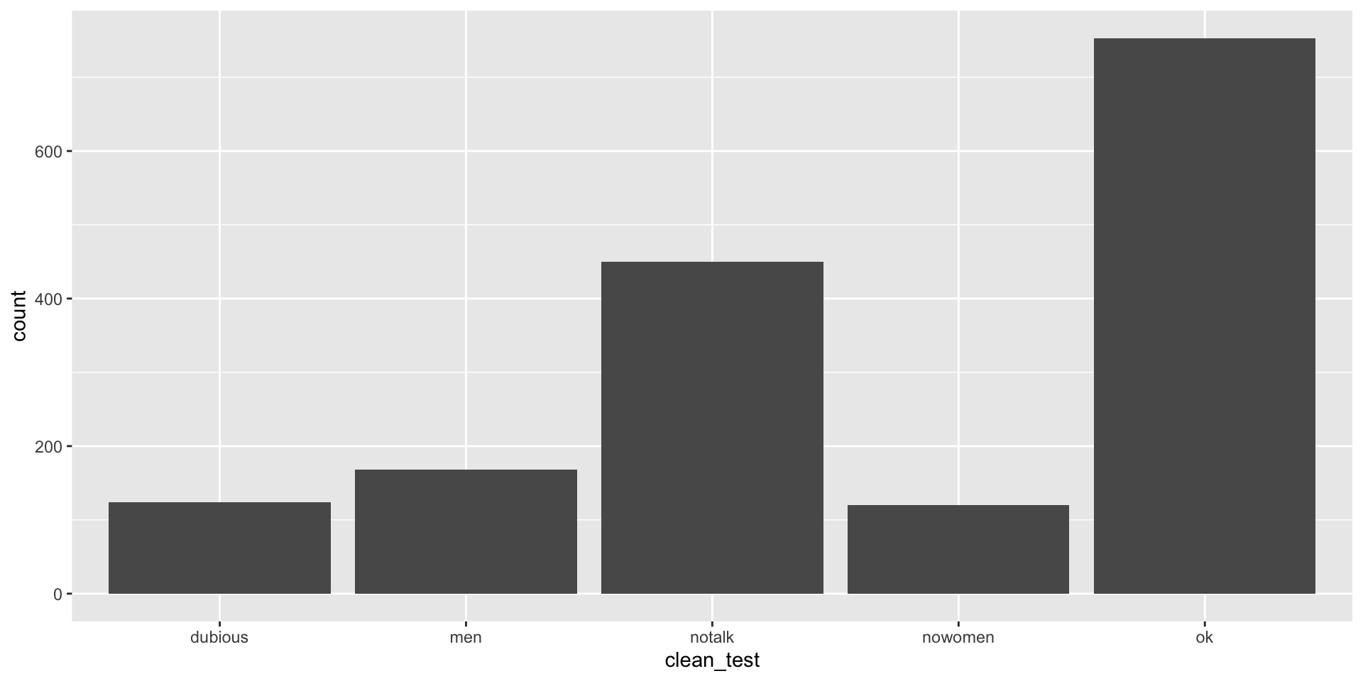
$ iqr <dbl> 300412109Picture: bar plot

Picture: bar plot
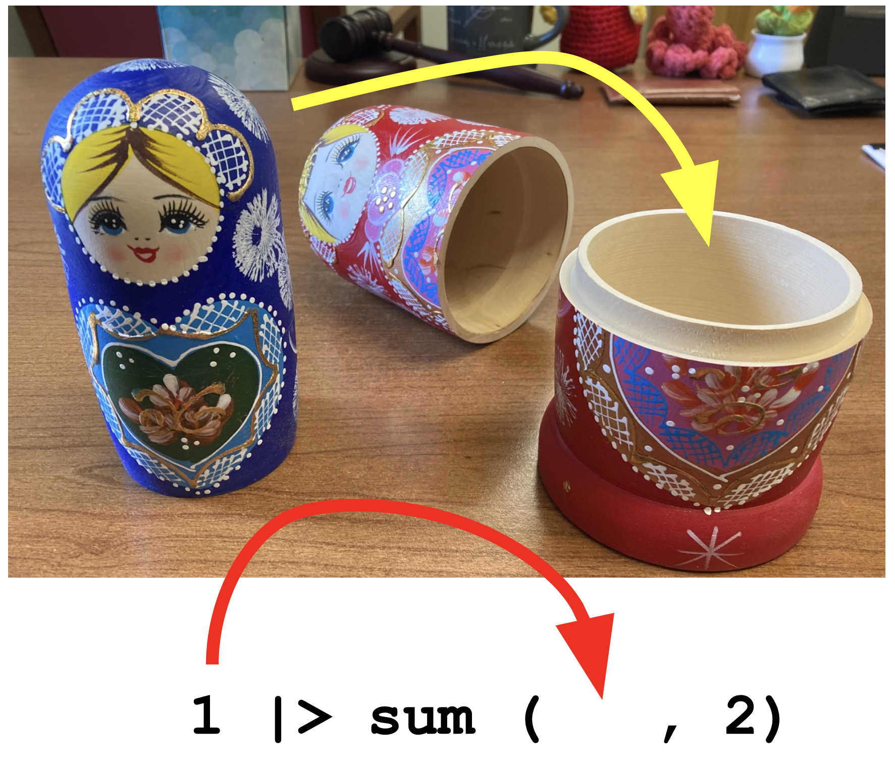
Seriously, it’s just like the dolls
This is so much harder to read
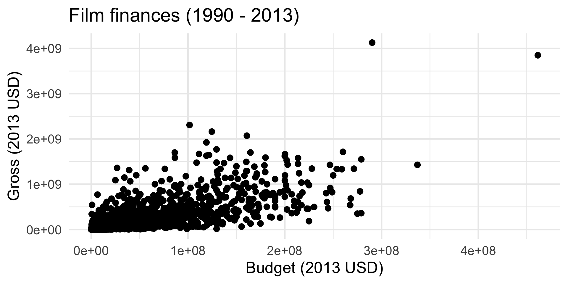
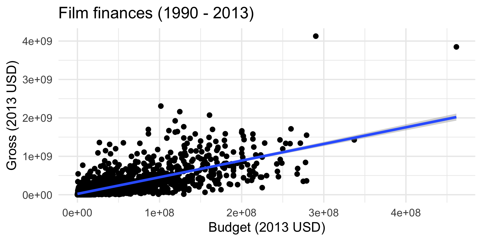
Scatter plot
Add a “trend” line
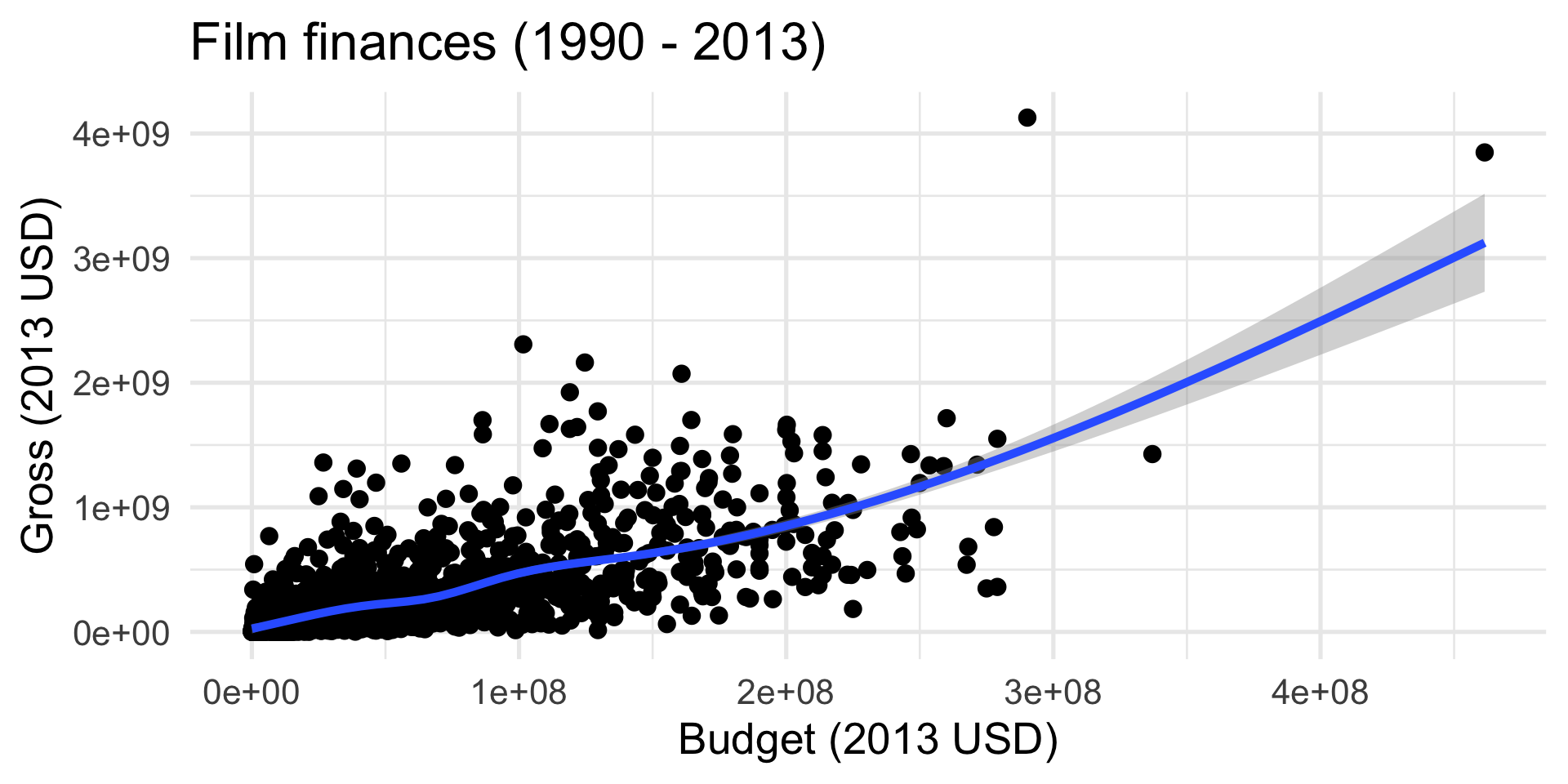
Add a “trend” line
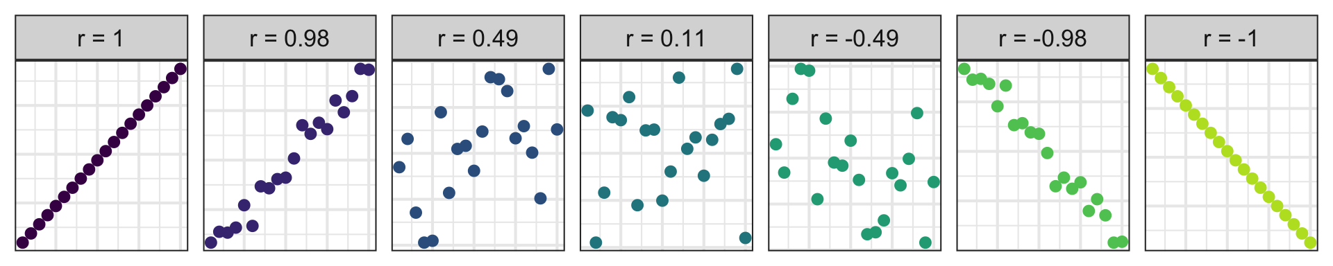
Correlation (more on this next week)
- Measures the strength and direction of the linear association between two numerical variables;
- Tells you how tightly the points cluster around a straight line;
- Ranges between -1 and 1;
- Same sign as the slope.
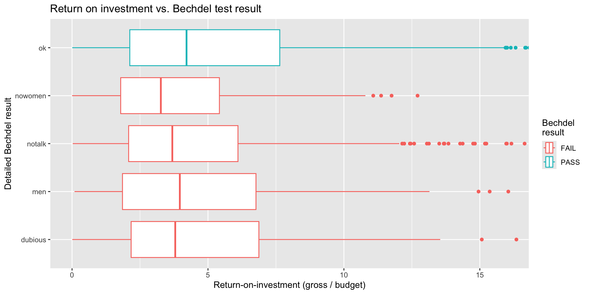
Side-by-side box plots (preferred)
Side-by-side histograms (…eh)
Code
bechdel |>
  mutate(
    clean_test = fct_rev(clean_test)
  ) |>
  ggplot(aes(x = roi, fill = binary)) +
  geom_histogram(binwidth = 0.5) +
  facet_wrap(~clean_test, nrow = 5) +
  labs(
    title = "Return on investment vs. Bechdel test result",
    x = "Return-on-investment (gross / budget)",
    y = "Detailed Bechdel result",
    fill = "Bechdel\nresult"
  ) +
  coord_cartesian(xlim = c(0, 16))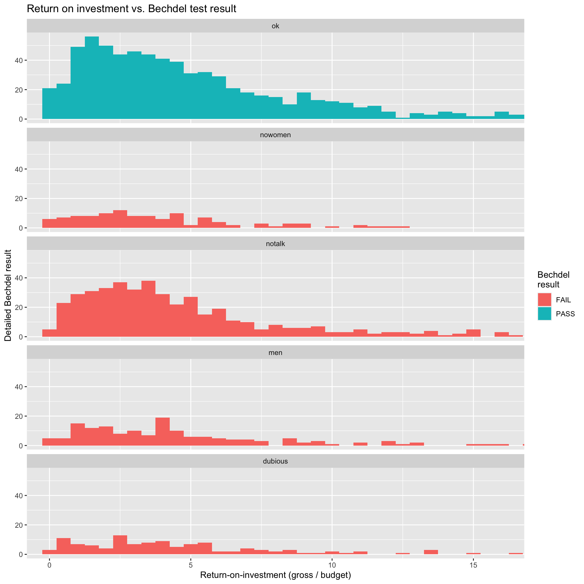
Computational themes
Every coding task in this class will be some combo of these two things:
Building cakes (ggplot)
Stacking dolls (pipe |>) 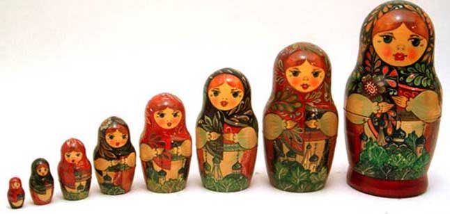
Master these, and everything will be coming up roses!