Lecture 1
Duke University
STA 101 Fall 2026
2026-08-27
Any questions about the syllabus?
If anything occurs to you later, please post on Ed.
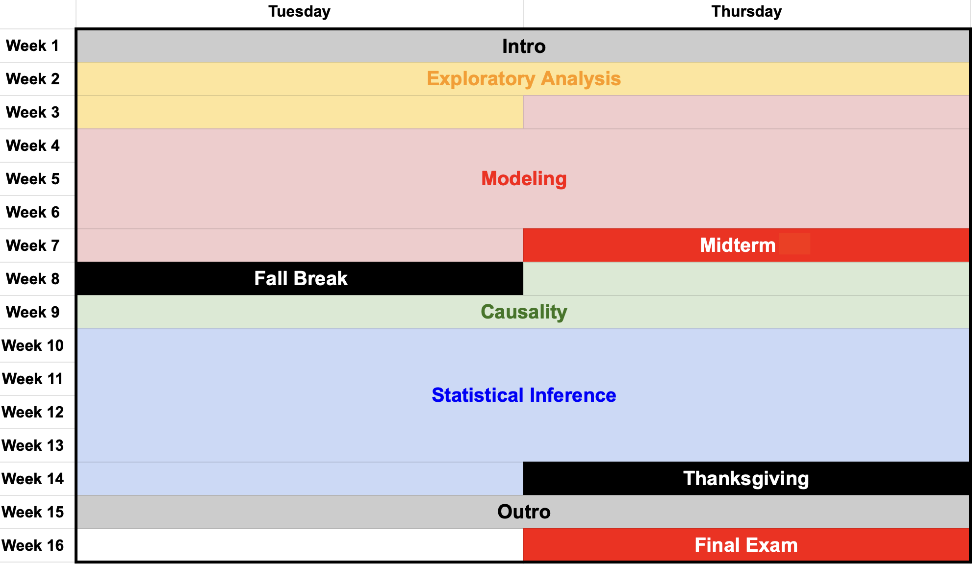
We’ll take…

So that you can see…

We’ll speedrun essentially all of the main ideas of the course so that you can get a sense of the outline of everything. Then we’ll spend the next fourteen weeks elaborating;
It’s gonna be a lot, and some things might be easier to follow than others. All you have to do is sit back and let it wash over you. We have the whole rest of the course to refine;
Please ask questions!


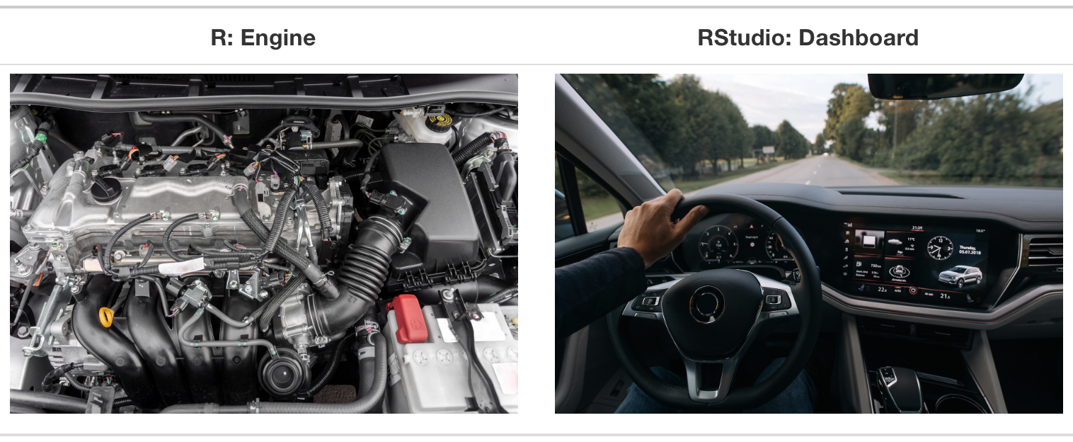
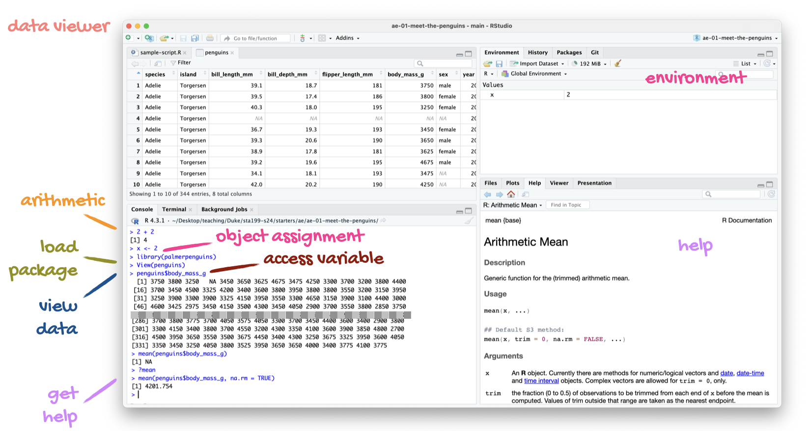
R is a programming language that statisticians created to make their work easier. If you learn to “speak” this language, you can instruct a computer to perform data analysis tasks that would be tedious to perform by hand.

RStudio is a convenient interface that allows you to use R in a clean and organized way. It is an example of an integrated development environment (IDE), but don’t worry about that.
tidyverse
The tidyverse is the package we will use most often. In fact, it’s really a “meta-package” that bundles many smaller packages that we will use:

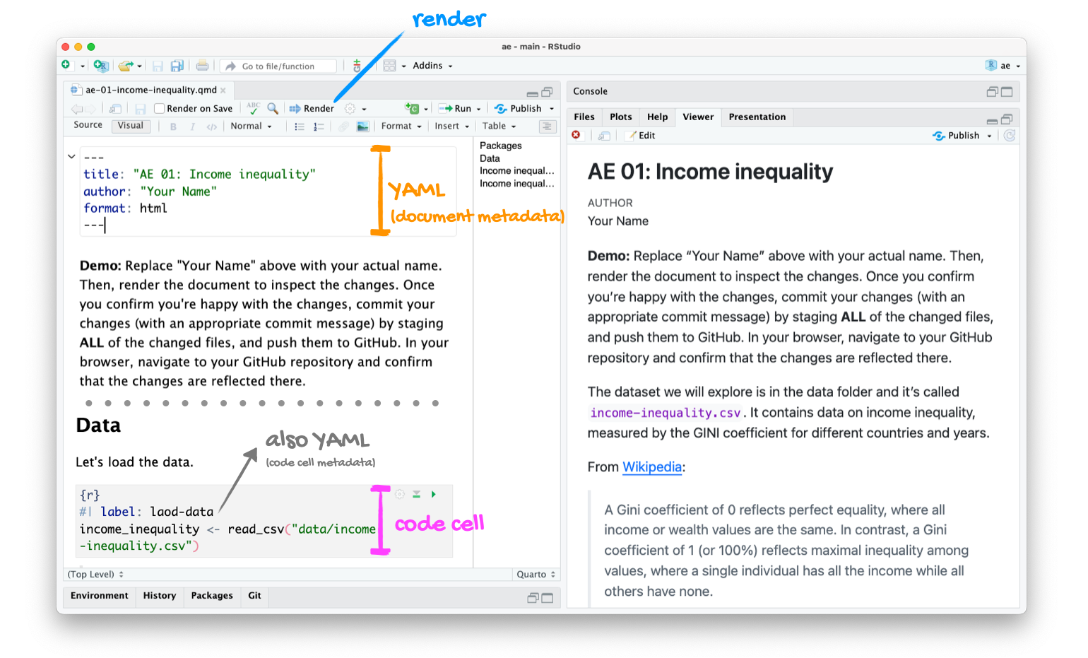
Quarto is a technical publishing system that allows you to write documents where text, math, code, and the output of that code are seamlessly integrated in a reproducible way.
This is pretty much it:
Edit the
.qmdfile → hit Render → get a
Computational reproducibility:
Scientific replication:
Our tools will help you achieve the first, which is necessary (but not sufficient!) for the second.
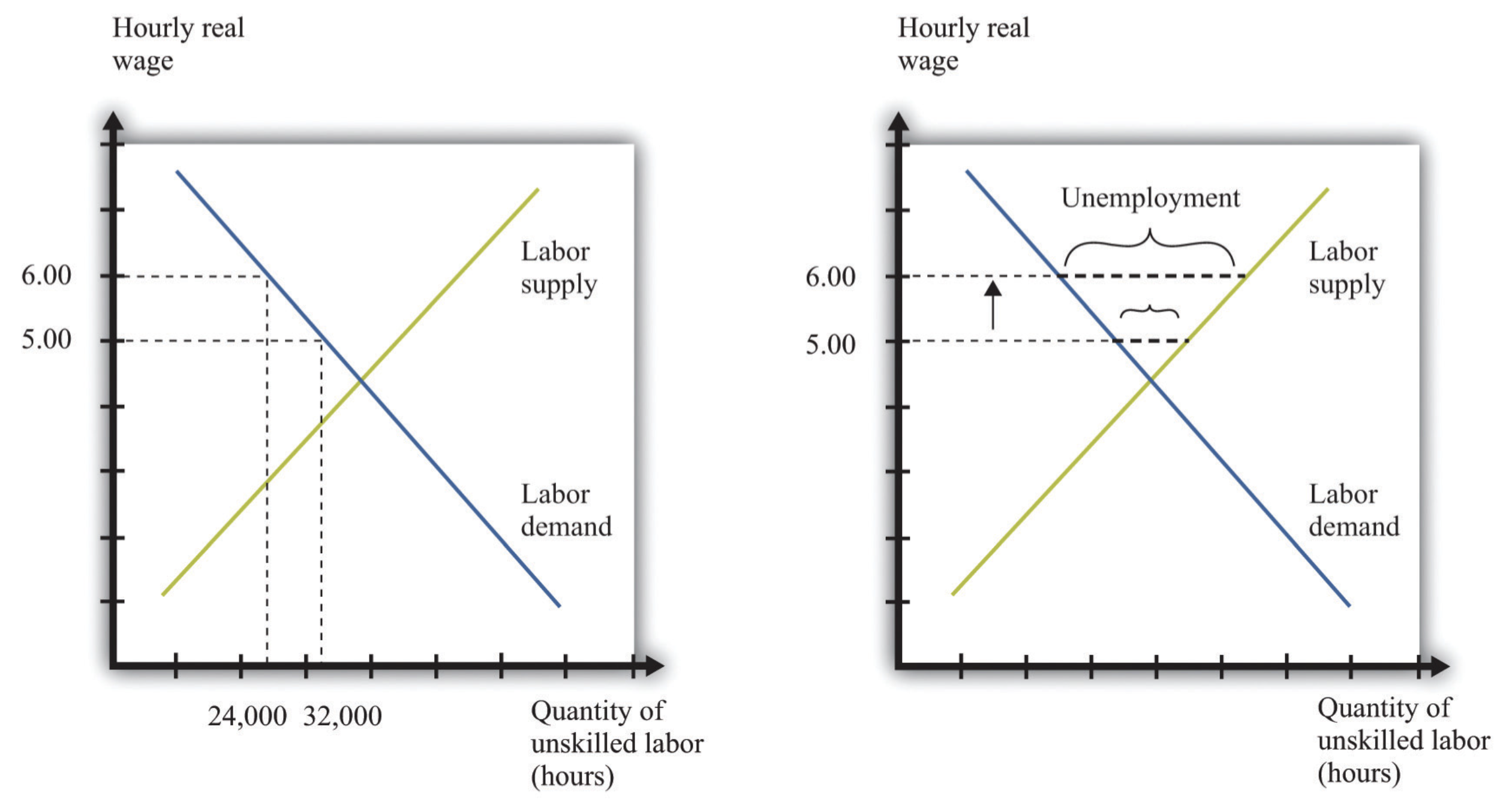
Is a higher minimum wage good? bad? neutral? idfk?
The reasoning goes like this:
This theoretical argument motivates a prediction about the world:
Claim
Raising the minimum wage decreases employment (puts people out of work).
Does real world experience (data) agree with the theoretical claim in the 101 textbook?
If you raise the minimum wage, does it decrease employment?
There is no cosmic, forever-and-always answer to that question. It will depend on:

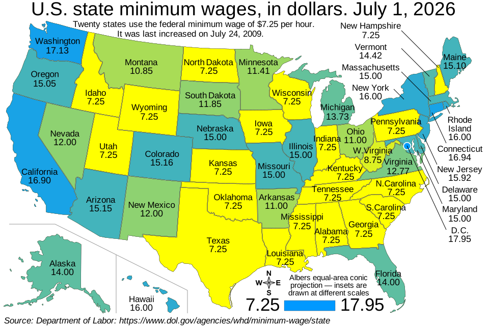
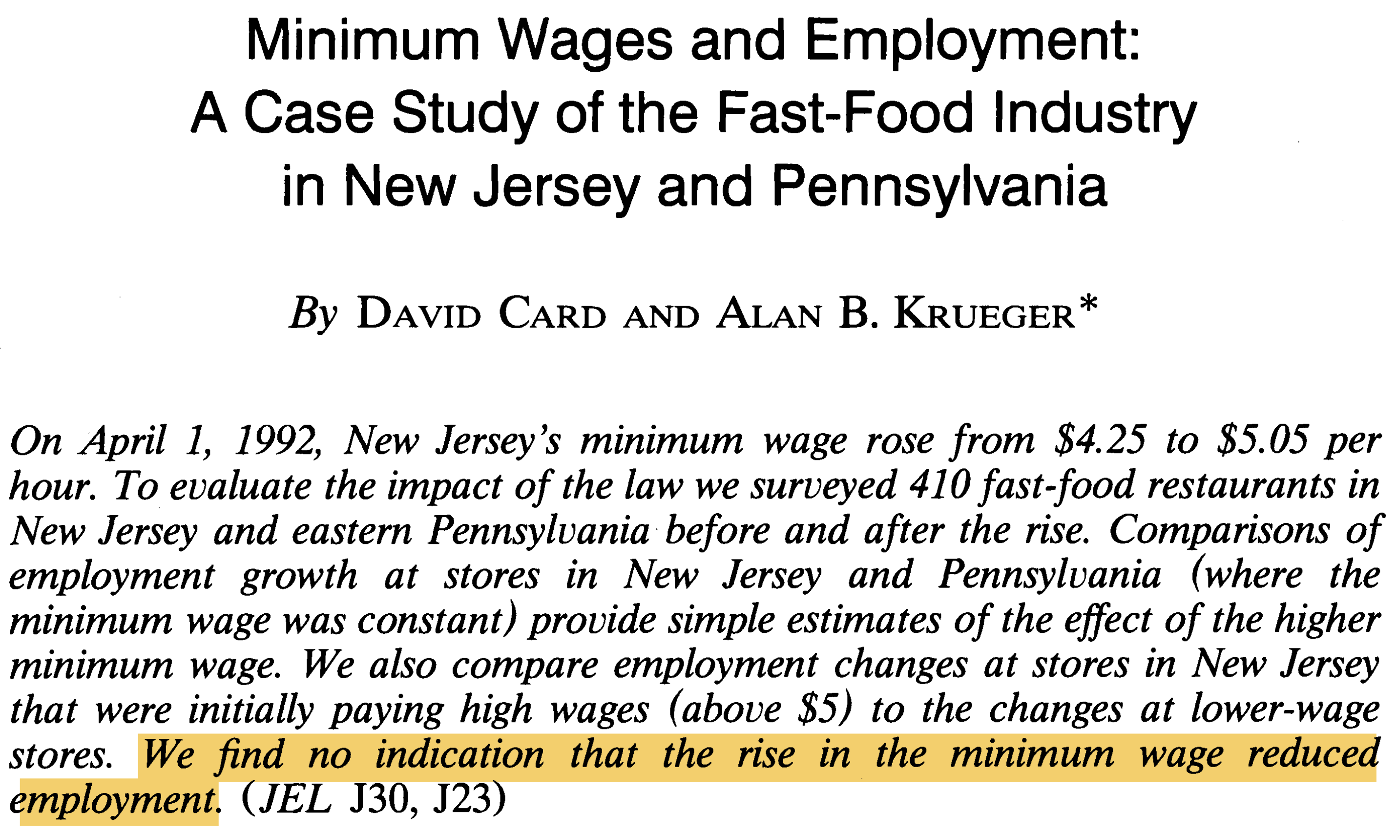
On April 1, 1992, New Jersey’s minimum wage rose from $4.25 to $5.05 per hour.
Did this policy change decrease employment in the fast-food industry?
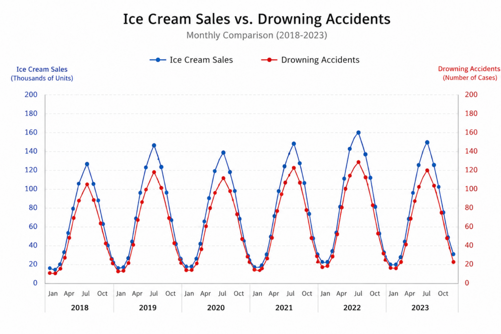
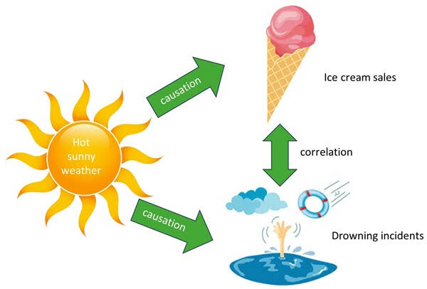
If you’ve heard it once you’ve heard it a thousand times:
Correlation does not imply causation.
For many causal questions we care about, cost, practicality, and ethics make it unfeasible to run the proper experiment that would actually be capable of answering the question.
Just seein’ what happened.
The researcher “passively” collects measurements without intervening to manipulate anything. So they can’t dictate treatment versus control, and they don’t know if observed differences between groups are caused by the treatment or by some other lurking factors.
When experiments are unfeasible to carry out, these are the only data we have.
As you learned at your grandmother’s knee:
Correlation does not imply causation.
If we observe a mere association in observational data, we have all of our work ahead of us to argue that there is nothing else going on, and therefore the association can plausibly support a causal interpretation.
Or can we?
They surveyed restaurants before and after:
Each of these is a source of uncertainty that affects the reliability of any downstream results.
That last bit doesn’t always make statisticians the most popular (“can you please just tell me the 🤬ing answer?”), but it’s our professional duty 🫡.
Behold, your second spreadsheet:
# A tibble: 351 × 13
id chain co_owned state emp_diff wage_st wage_st2 hrsopen hrsopen2 fte
<dbl> <chr> <dbl> <chr> <dbl> <dbl> <dbl> <dbl> <dbl> <dbl>
1 56 Wendy's 1 PA -14 5 5.25 12 12 34
2 61 Wendy's 1 PA 11.5 5.5 4.75 12 12 24
3 445 Burger… 0 PA -41.5 5 4.75 18 18 70.5
4 451 Burger… 0 PA 13 5 5 24 24 23.5
5 455 KFC 1 PA 0 5.25 5 10 11 11
6 458 KFC 1 PA -0.5 5 5 10 10.5 9
7 462 Roy's 1 PA 2 5 4.75 12.5 12 15.5
8 468 Burger… 0 PA -29 5 5 18 18 58
9 469 Burger… 0 PA 4 5 4.5 18 18 26.5
10 470 Burger… 0 PA -2.5 5.5 4.75 18 18 28.5
# ℹ 341 more rows
# ℹ 3 more variables: fte2 <dbl>, meal_price <dbl>, meal_price2 <dbl>
<-
You just saw me do this:
<-.A data frame is R’s version of a spreadsheet.
How many rows and columns?
So they surveyed 351 restaurants in all, and they recorded 13 pieces of information about each one.
Each row is a restaurant, and for each restaurant, we record the following:
state: which state is the restaurant in?chain: which restaurant chain does the store belong to?co_owned: is the restaurant company owned?wage_st and wage_st2: the starting wage in US dollars before and after policy change;fte and fte2: full-time-equivalent employment before and after the change, calculated as the number of full-time workers (including managers) plus 0.5 times the number of part-time workers;hrsopen and hrsopen2: number of hours open per day;meal_price and meal_price2: the price of a meal (soda, fries, entree);emp_diff: fte2 - fte.The chain variable is an example of a categorical variable:
[1] "Wendy's" "Wendy's" "Burger King" "Burger King" "KFC"
[6] "KFC"
The meal_price variable is an example of a numerical variable:
[1] 3.48 3.29 2.86 2.85 3.78 3.99
The appropriate visualization or summary depends on the variable type.
How many restaurants do we observe in each state?
# A tibble: 4 × 2
chain n
<chr> <int>
1 Burger King 145
2 KFC 74
3 Roy's 87
4 Wendy's 45
Feels like something’s missing, doesn’t it?
They did try calling McDonald’s restaurants, but they got very low response rates and chose to omit them from the study.
|>
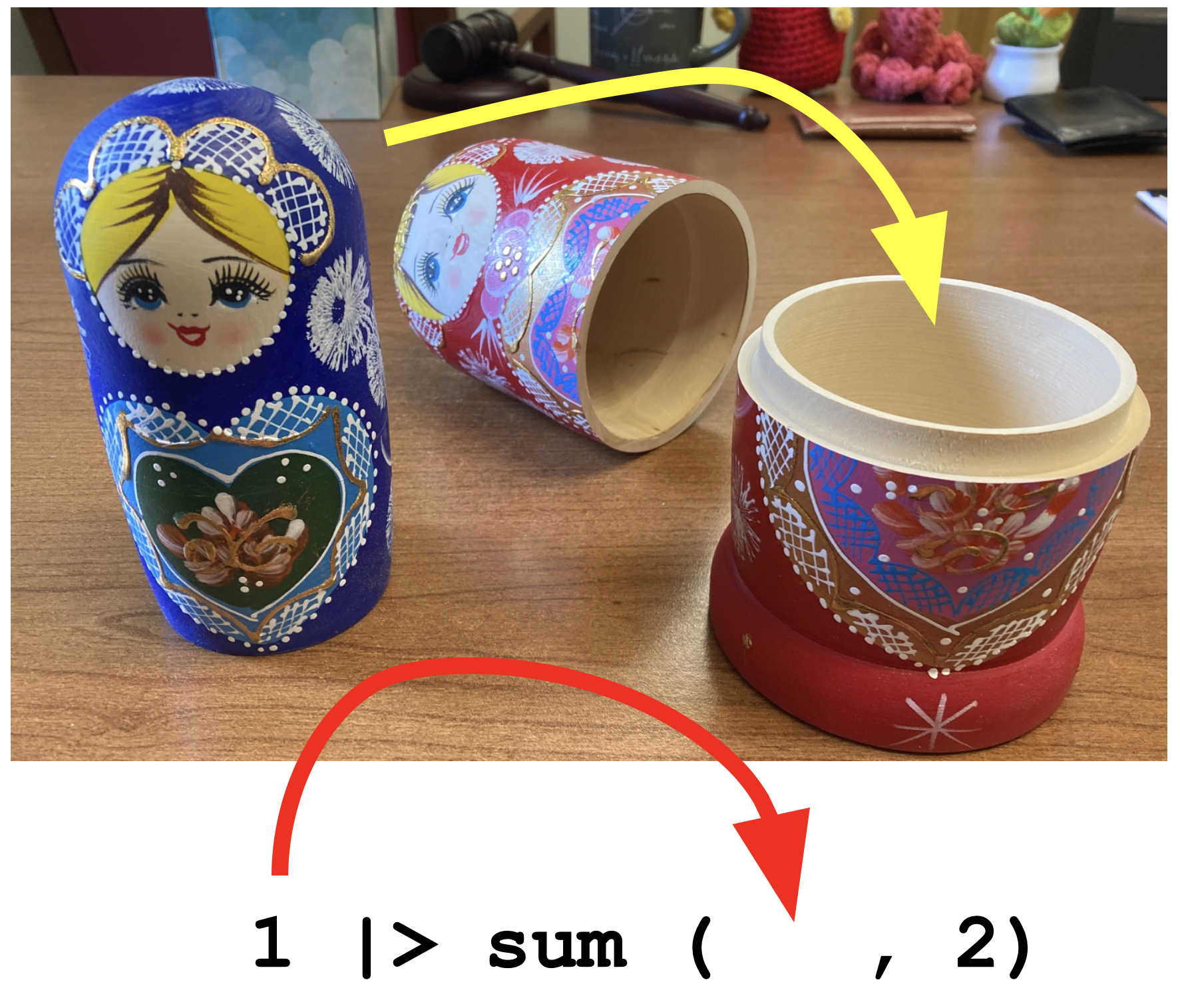
The pipe operator passes what comes before it into the function that comes after it as the first argument in that function:
We will use it to build up data summaries and transformations step-by-step.
In order for Card and Krueger’s idea to hold water, the restaurants in NJ and PA should look broadly similar prior to the intervention.
So let’s compare:
These are the overall totals. How do we get the totals within the states?
Make it a grouped data frame:
Subsequent calculations will now be done within the groups (eg. states):
To directly compare, let’s look at proportions:
# A tibble: 8 × 4
# Groups: state [2]
state chain n prop
<fct> <chr> <int> <dbl>
1 PA Burger King 30 0.455
2 PA KFC 10 0.152
3 PA Roy's 15 0.227
4 PA Wendy's 11 0.167
5 NJ Burger King 115 0.404
6 NJ KFC 64 0.225
7 NJ Roy's 72 0.253
8 NJ Wendy's 34 0.119
Let’s make it easier to compare by eye:
# A tibble: 8 × 4
# Groups: state [2]
state chain n prop
<fct> <chr> <int> <dbl>
1 PA Burger King 30 0.455
2 NJ Burger King 115 0.404
3 PA KFC 10 0.152
4 NJ KFC 64 0.225
5 PA Roy's 15 0.227
6 NJ Roy's 72 0.253
7 PA Wendy's 11 0.167
8 NJ Wendy's 34 0.119
Start with a blank canvas:
What variables are we looking at?
The aesthetic mapping is where we tell the computer what variables in the data frame we want to use and how we want to use them.
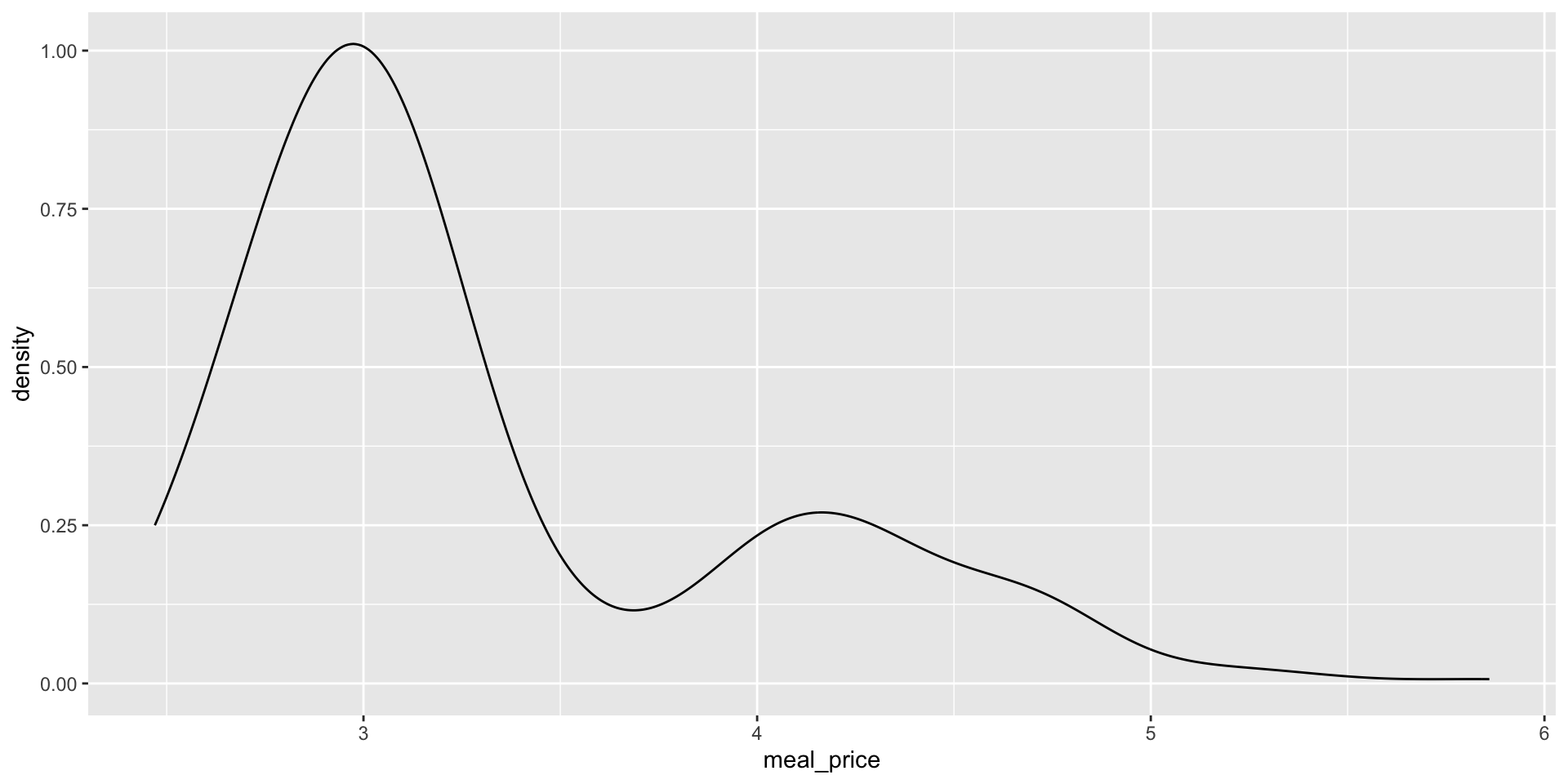
What kind of plot for this numerical variable:
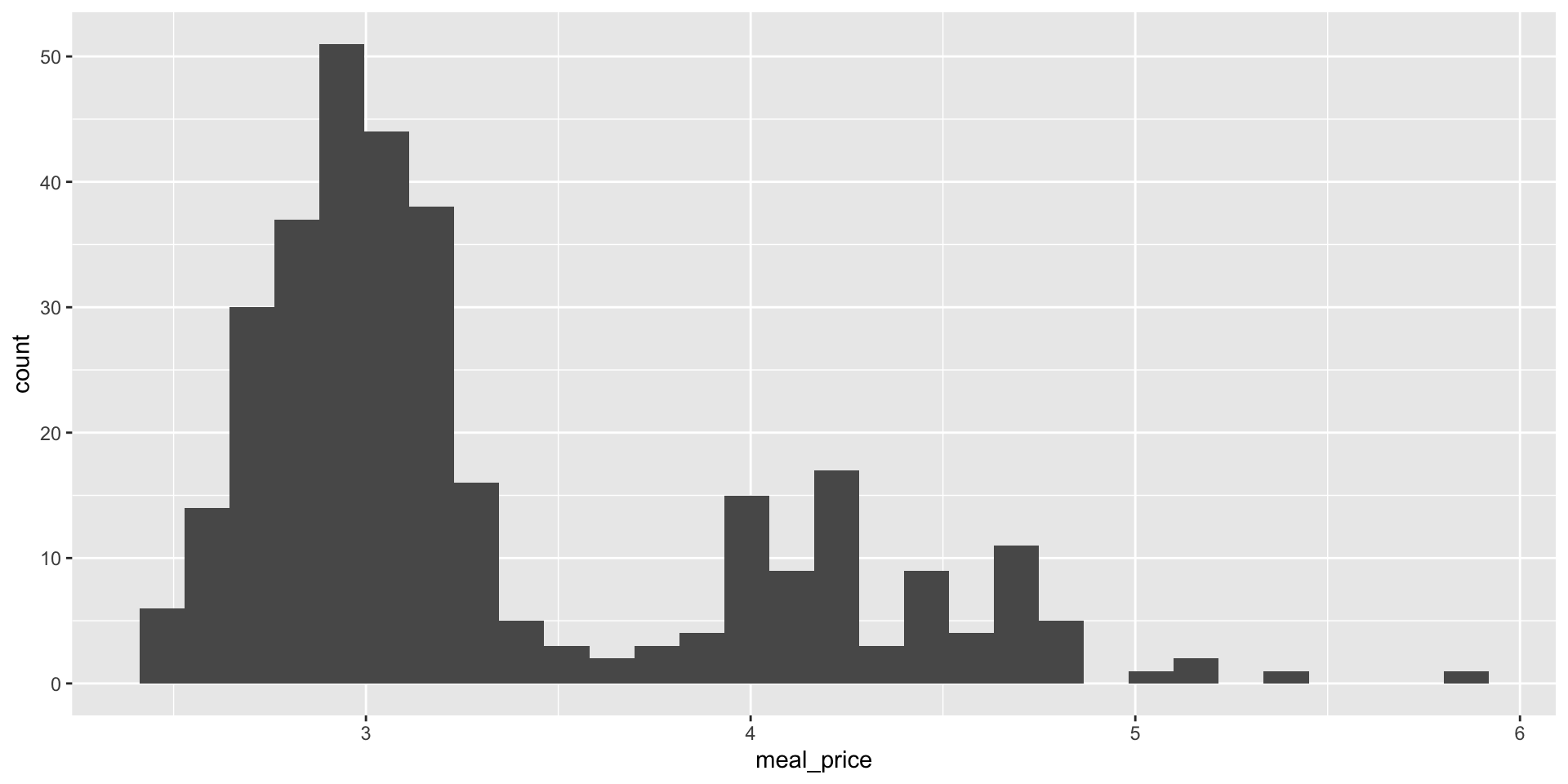
Another option:
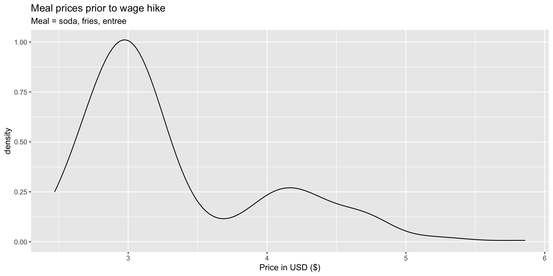
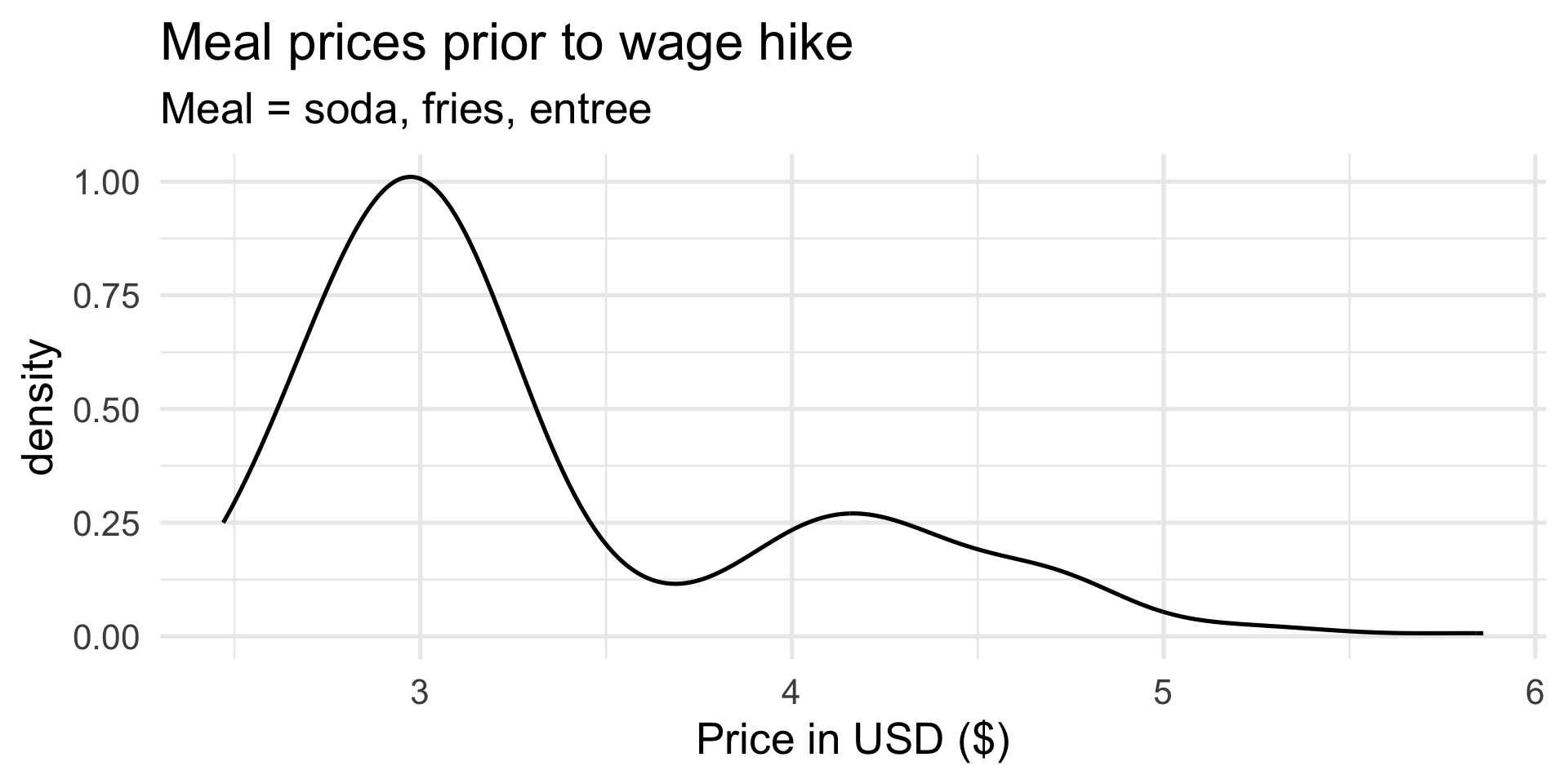
A density plot is a “smoothed out” histogram.
Add labels:

Y’know…so we know what we’re looking at!
Increase font size and give it a minimalist look:
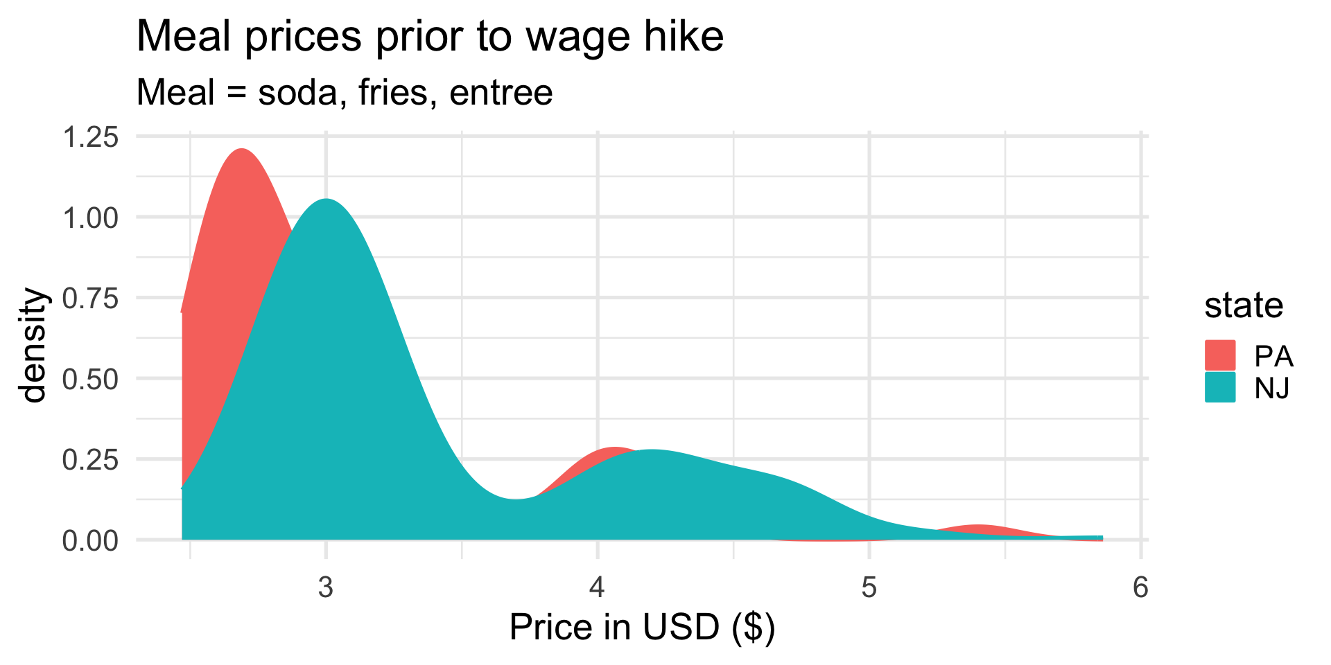
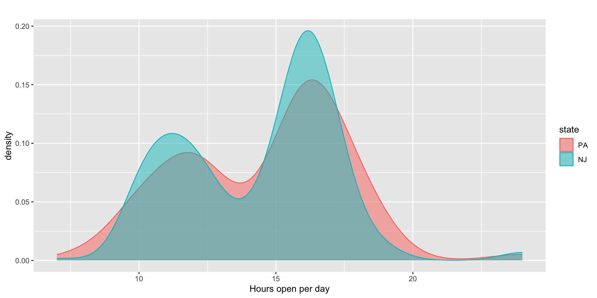
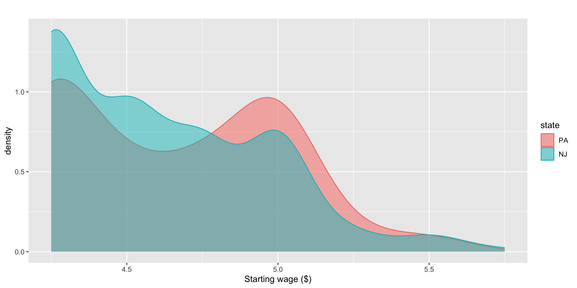
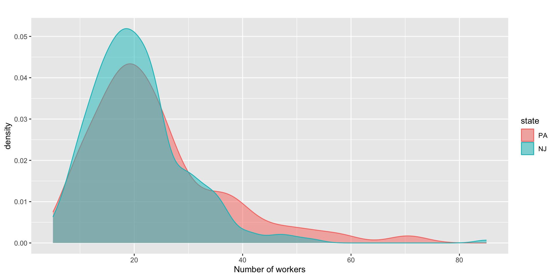
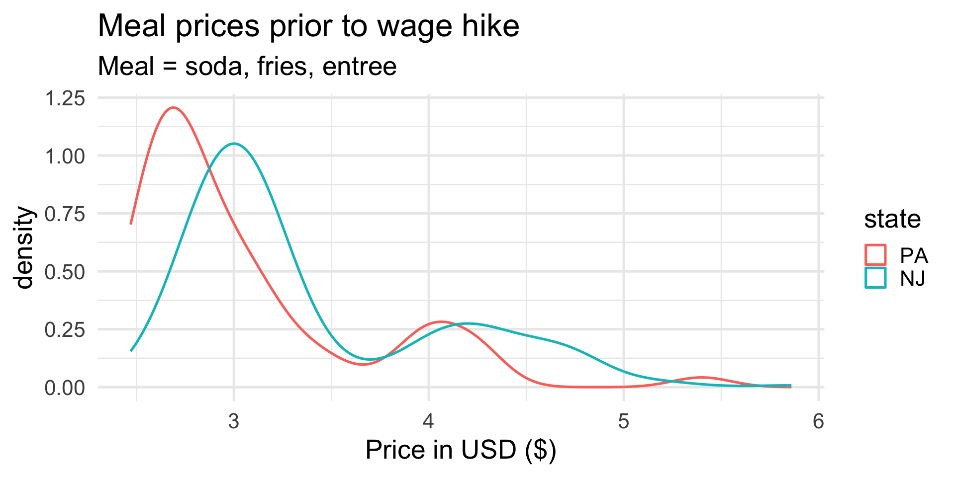
Distinguish the two states with color:
Shade (fill) beneath the curves:
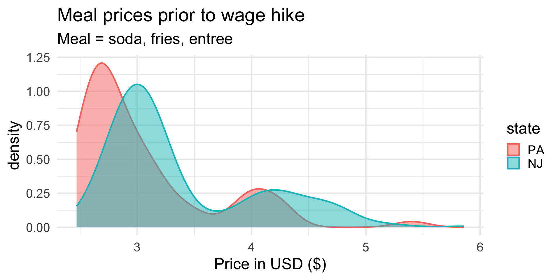
Make the color translucent:

These distributions look pretty similar.

This design philosophy is described in the book The Grammar of Graphics and implemented in the ggplot2 package.

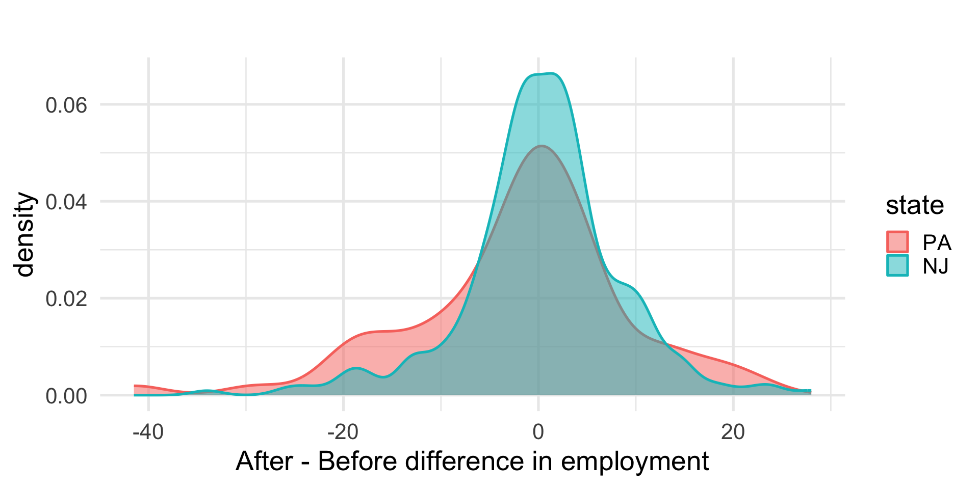
These data seem to pass the first sanity check: prior to “treatment,” the restaurants looked roughly comparable across the two states. What about after treatment?
emp_diff variableThis is employment after the wage hike minus employment before the wage hike:
emp_diff > 0: the restaurant added workers;emp_diff == 0: the restaurant didn’t change;emp_diff < 0: the restaurant shed workers.If the ECON 101 story is correct, we expect emp_diff to be lower on average for NJ than for PA.
# A tibble: 2 × 2
state avg_emp_diff
<fct> <dbl>
1 PA -1.88
2 NJ 0.398
Oh. That is…flipped from what we expected.
If the ECON 101 story is true, then the minimum wage hike should put NJ below PA, either adding fewer workers, or literally laying them off. Pictures and simple summaries are not showing that.
Now what?
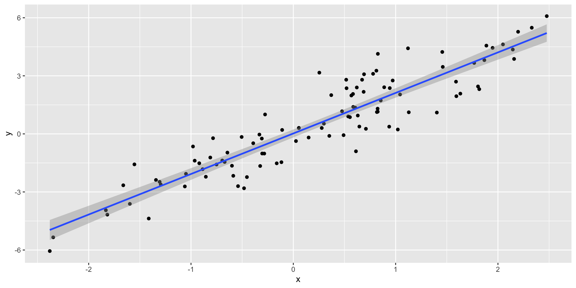
Think of the “line of best fit:”
This is an example of a linear regression model. All of the models in our class will have this flavor.
(this is where things will start to get technical…)
Our analysis has several ingredients:
emp_diff;state, NJ or PA;chain, hrsopen, meal_price, etc.Our goal is to estimate the (causal!) effect that the treatment has on the response. In order to make sure we are isolating the causal effect of the treatment, unconfounded by other factors, we may want to control for the extra covariates. A model helps us do this.
(feel free to avert your gaze)
Here’s a linear regression model for the data:
\[ y_i = \alpha + \tau T_i+\mathbf{x}_i^{\scriptscriptstyle\mathsf{T}}\boldsymbol{\beta}+\varepsilon_i, \]
where \(y_i\) is emp_diff, \(\mathbf{x}_i\) is a collection of covariates, and
\[ T_i = \begin{cases} 0 & \text{for PA}\\ 1 & \text{for NJ}. \end{cases} \]
So \(\tau\) is the average difference between emp_diff in NJ and in PA. ECON 101 says this should be negative. Our exploratory analysis looked like it was zero, or possibly even positive.
There’s that pipe again:
# A tibble: 6 × 5
term estimate std.error statistic p.value
<chr> <dbl> <dbl> <dbl> <dbl>
1 (Intercept) -1.45 1.21 -1.20 0.232
2 stateNJ 2.28 1.20 1.91 0.0575
3 chainKFC 0.235 1.30 0.181 0.857
4 chainRoy's -2.08 1.32 -1.58 0.116
5 chainWendy's -0.757 1.49 -0.507 0.612
6 co_owned 0.373 1.10 0.339 0.735
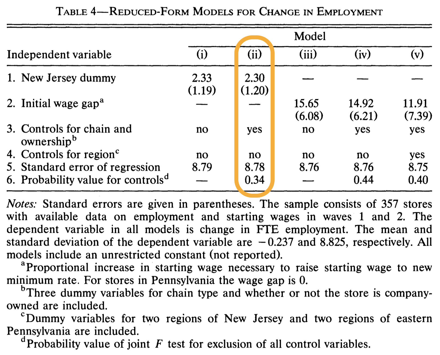
The estimate on stateNJ is what we interpret as the treatment effect.
Our estimate of the treatment effect is roughly 2.3, with a standard error of 1.2;
Our headline finding:
On average, employment increased by about 2.3 more workers in New Jersey restaurants than in Pennsylvania restaurants. So if anything, NJ had a better outcome compared to PA.
Is this a slam dunk, money-in-the-bank, bulletproof result? Of course not. It’s the best we can do with the imperfect data we have. So let’s be honest and faithful and say something about its reliability.
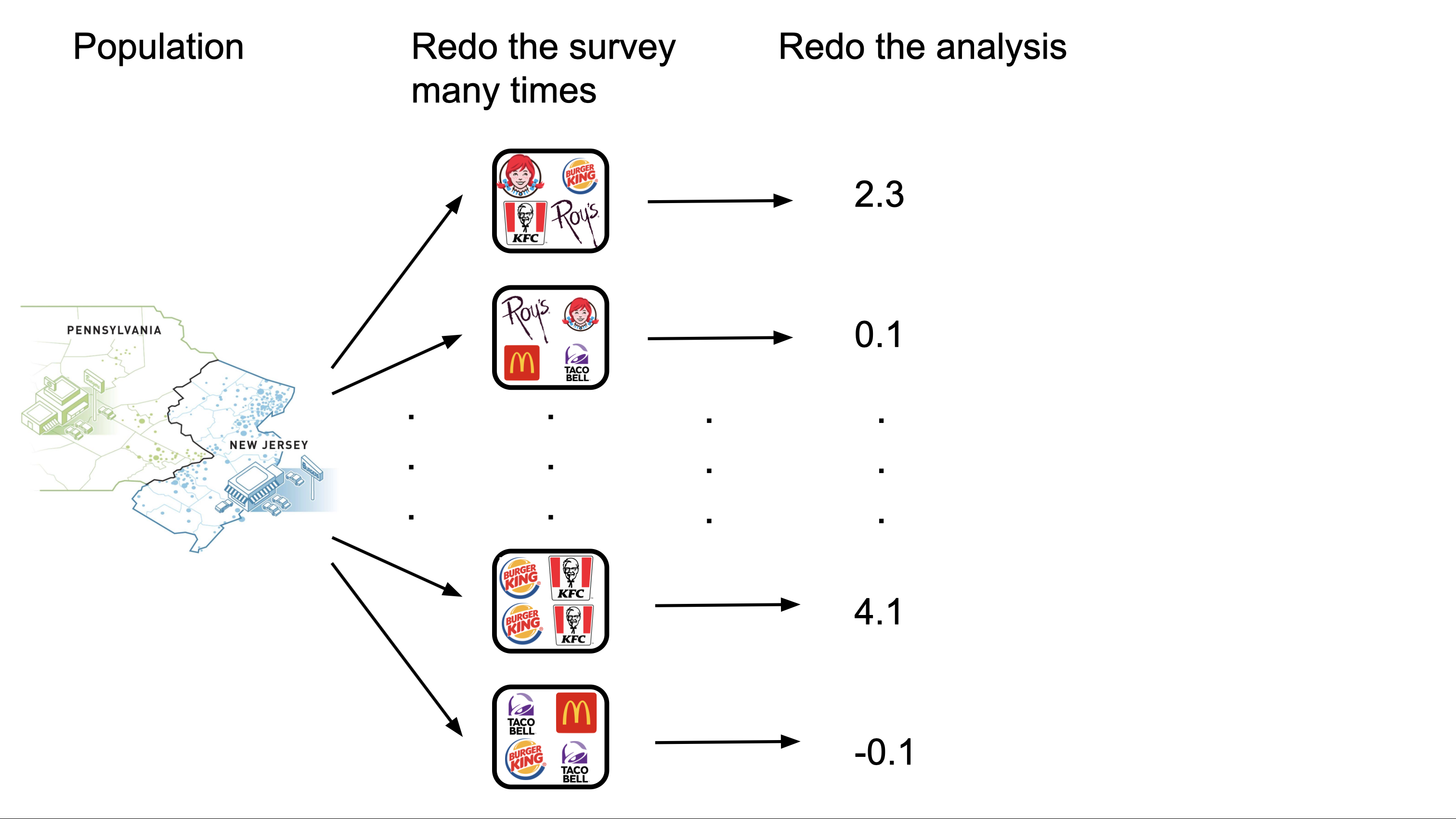
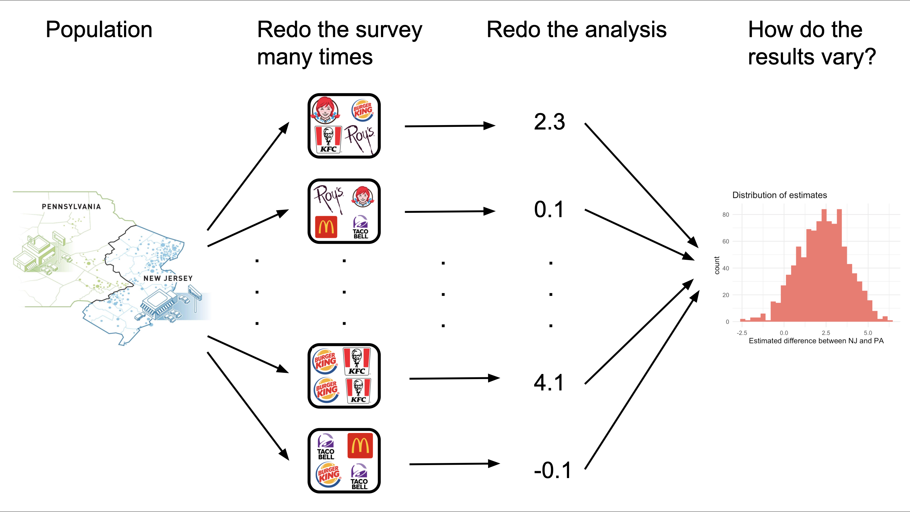
How can we evaluate that?
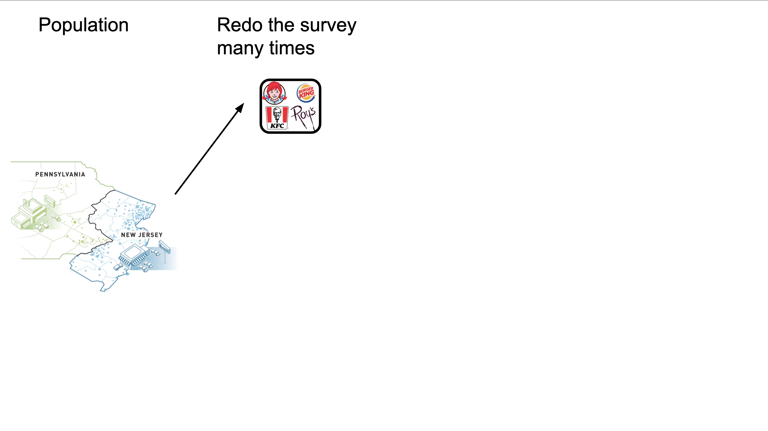
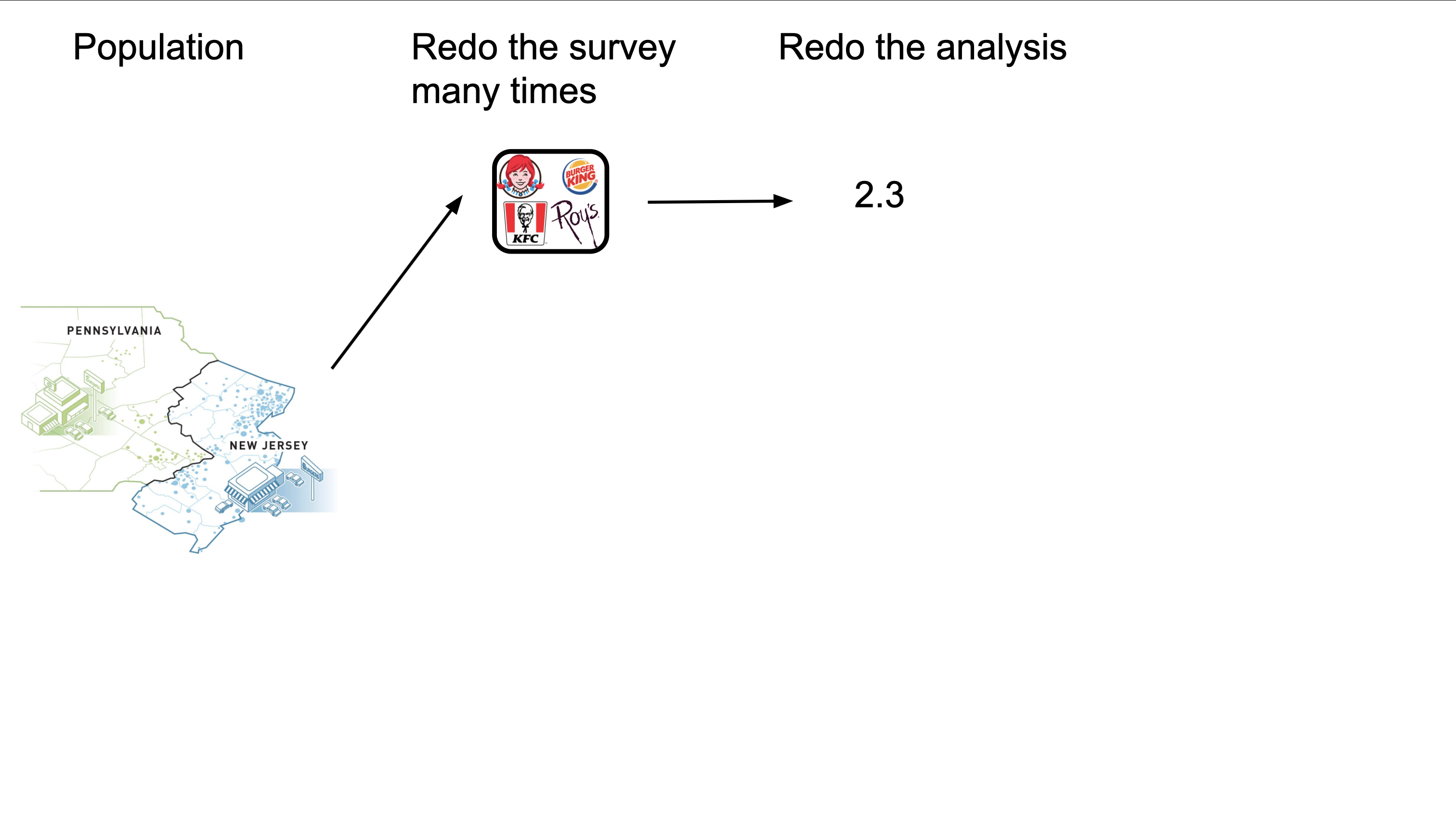
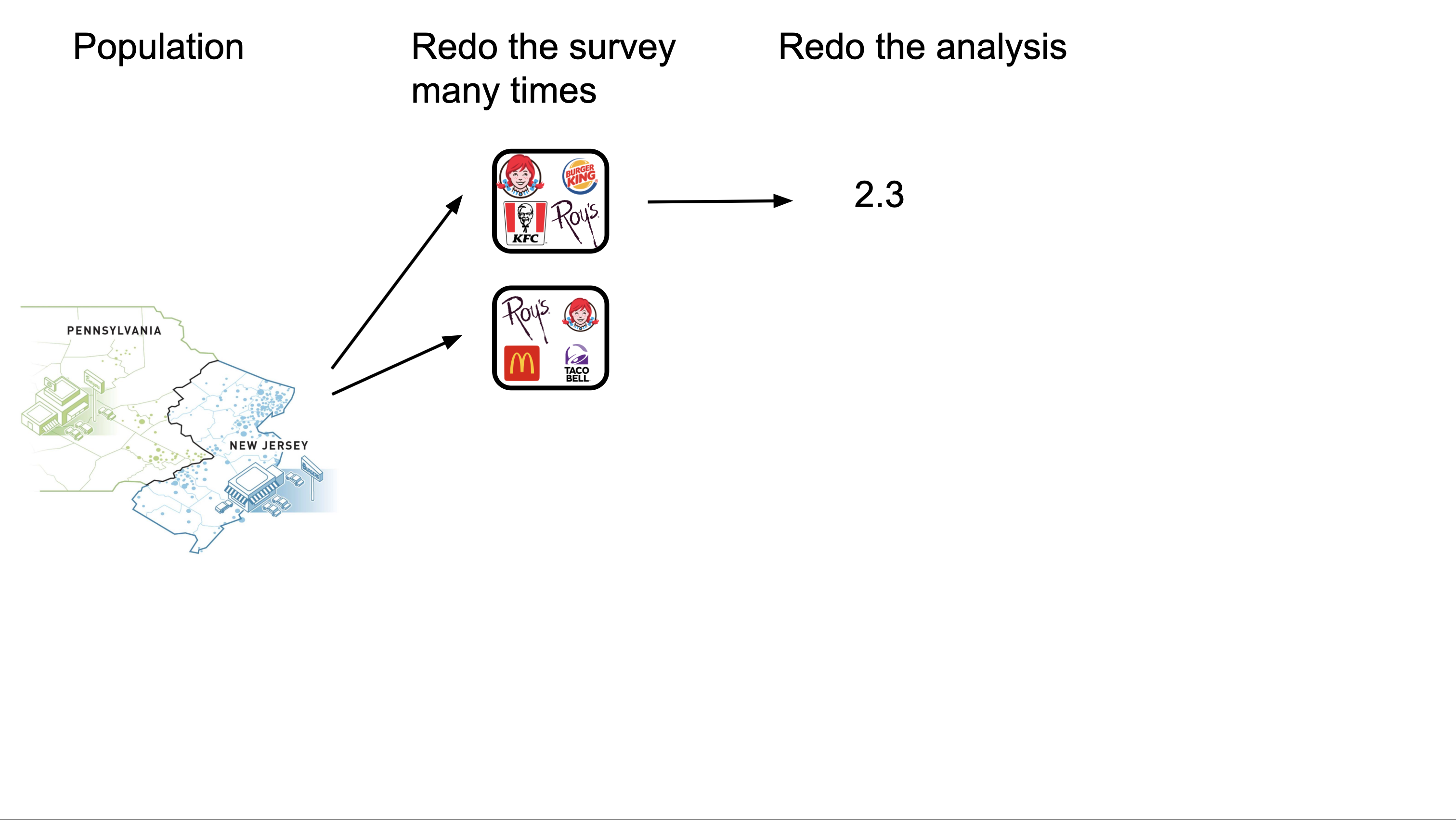
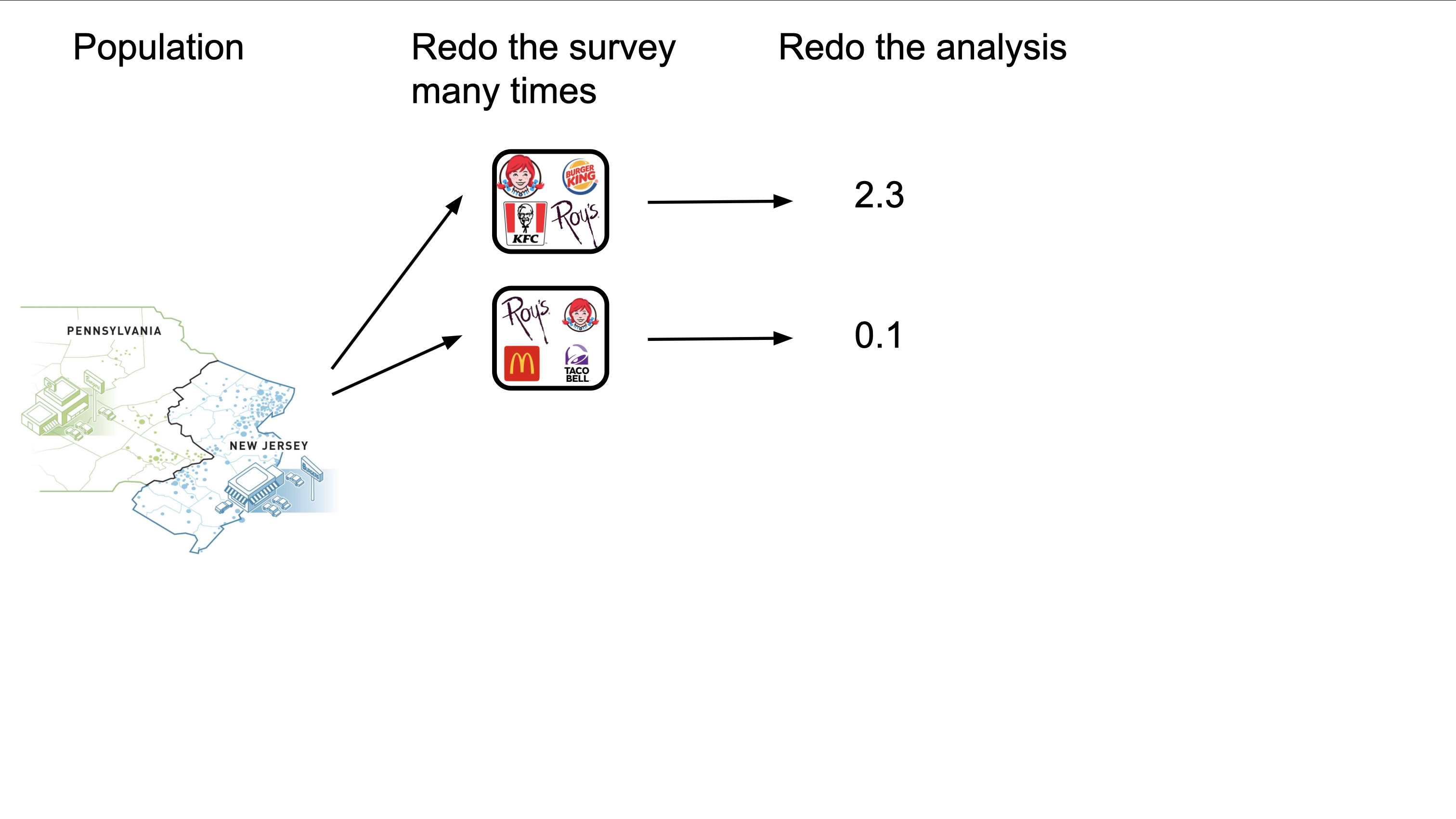
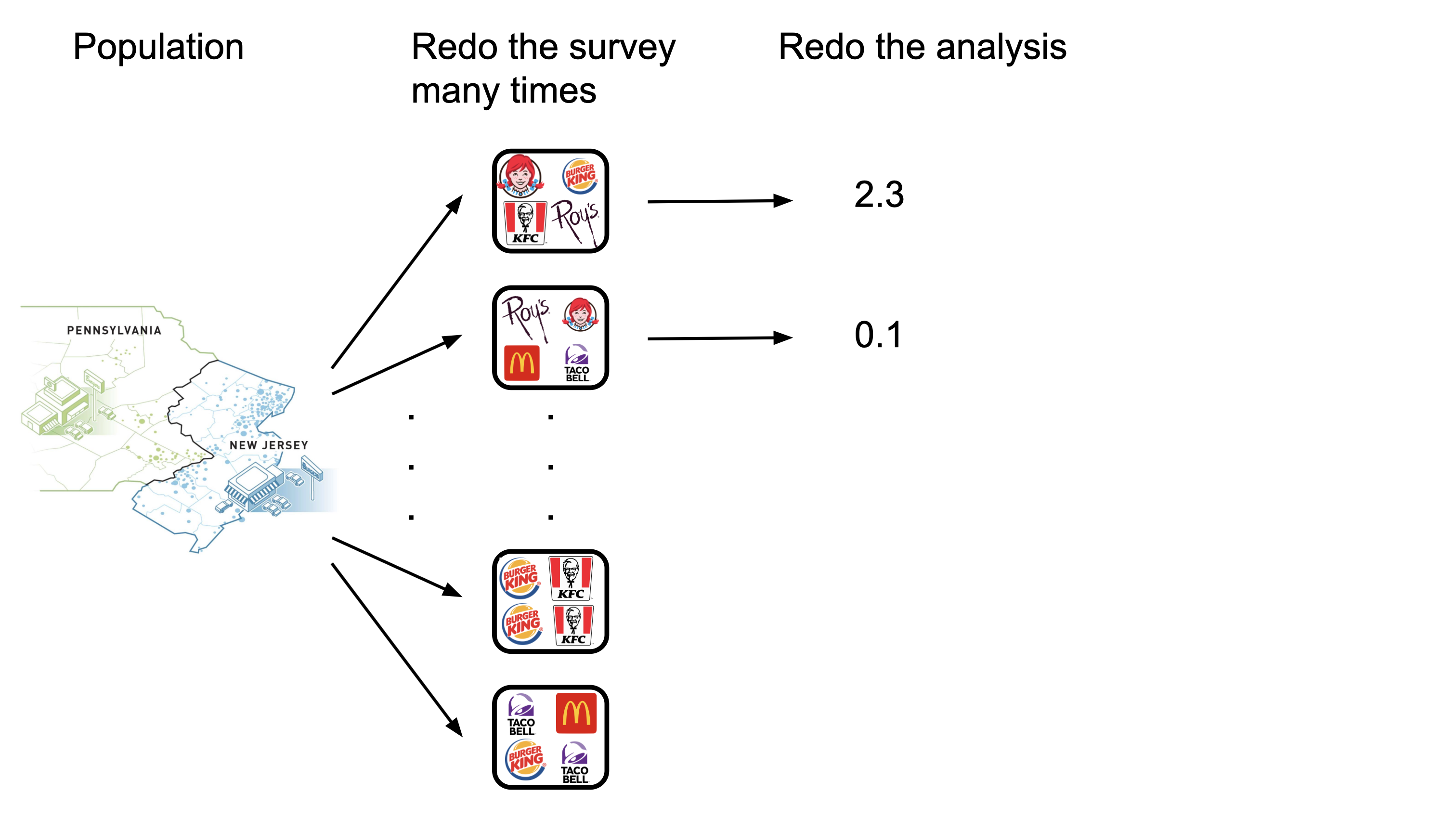
Redo the survey and get a new data frame:
# A tibble: 351 × 4
emp_diff state chain co_owned
<dbl> <fct> <chr> <dbl>
1 -2 NJ KFC 0
2 6 NJ Burger King 0
3 -3 NJ Roy's 1
4 3.25 PA KFC 1
5 0 PA Wendy's 0
6 4 NJ KFC 0
7 2 NJ Burger King 1
8 2 NJ Burger King 1
9 14.8 NJ KFC 1
10 2.5 NJ Burger King 0
# ℹ 341 more rows
Rerun the regression and get a new estimate:
linear_reg() |>
fit(emp_diff ~ state + chain + co_owned, data = card_krueger_new) |>
tidy() |>
select(term, estimate, std.error)# A tibble: 6 × 3
term estimate std.error
<chr> <dbl> <dbl>
1 (Intercept) -0.187 1.12
2 stateNJ 0.689 1.13
3 chainKFC 0.677 1.34
4 chainRoy's -1.98 1.32
5 chainWendy's -0.0917 1.39
6 co_owned 0.0815 1.07
Redo the survey and get a new data frame:
# A tibble: 351 × 4
emp_diff state chain co_owned
<dbl> <fct> <chr> <dbl>
1 8.5 NJ Burger King 1
2 -0.5 NJ Roy's 1
3 5.5 NJ Burger King 1
4 -2 NJ KFC 0
5 -1.5 NJ KFC 1
6 2.5 NJ Burger King 0
7 3.5 NJ Burger King 0
8 4 NJ Burger King 0
9 0 NJ Burger King 0
10 8.25 NJ Burger King 0
# ℹ 341 more rows
Rerun the regression and get a new estimate:
linear_reg() |>
fit(emp_diff ~ state + chain + co_owned, data = card_krueger_new) |>
tidy() |>
select(term, estimate, std.error)# A tibble: 6 × 3
term estimate std.error
<chr> <dbl> <dbl>
1 (Intercept) -1.02 1.32
2 stateNJ 1.26 1.27
3 chainKFC 0.0746 1.29
4 chainRoy's -1.72 1.36
5 chainWendy's -0.707 1.69
6 co_owned 1.29 1.14
Redo the survey and get a new data frame:
# A tibble: 351 × 4
emp_diff state chain co_owned
<dbl> <fct> <chr> <dbl>
1 -6.5 NJ KFC 0
2 -4 NJ Burger King 0
3 -7 NJ Roy's 1
4 -13 NJ KFC 1
5 -1.5 NJ Burger King 0
6 2.5 NJ KFC 1
7 19 PA Burger King 0
8 3.5 NJ Burger King 0
9 13.2 NJ Roy's 1
10 -3 NJ KFC 0
# ℹ 341 more rows
Rerun the regression and get a new estimate:
linear_reg() |>
fit(emp_diff ~ state + chain + co_owned, data = card_krueger_new) |>
tidy() |>
select(term, estimate, std.error)# A tibble: 6 × 3
term estimate std.error
<chr> <dbl> <dbl>
1 (Intercept) 0.930 1.18
2 stateNJ 0.438 1.15
3 chainKFC -0.751 1.21
4 chainRoy's -3.05 1.22
5 chainWendy's -1.82 1.41
6 co_owned 0.333 0.996
What do you think? Are our conclusions reliable?
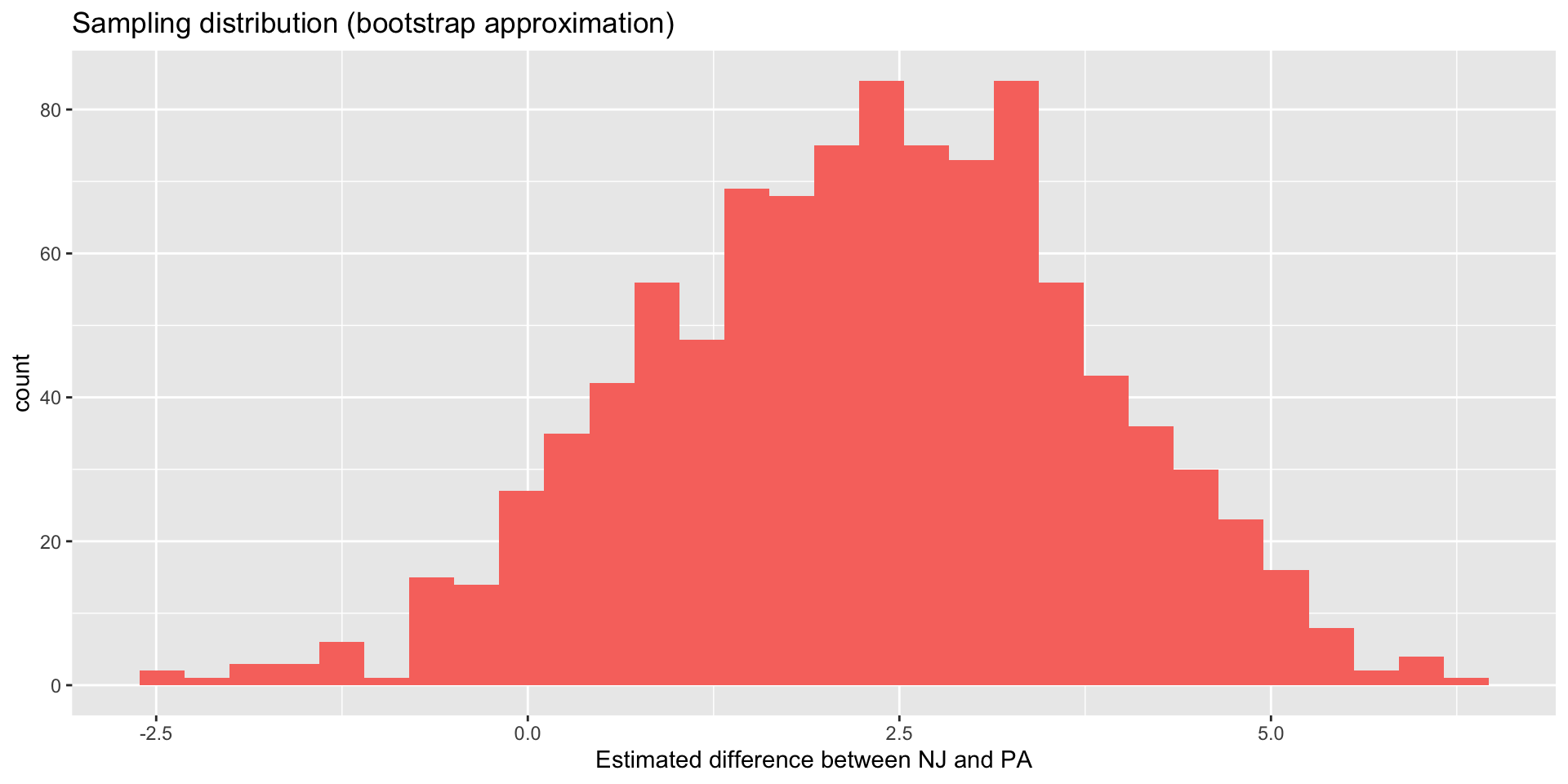
What if our sampling distribution had looked like one of these?
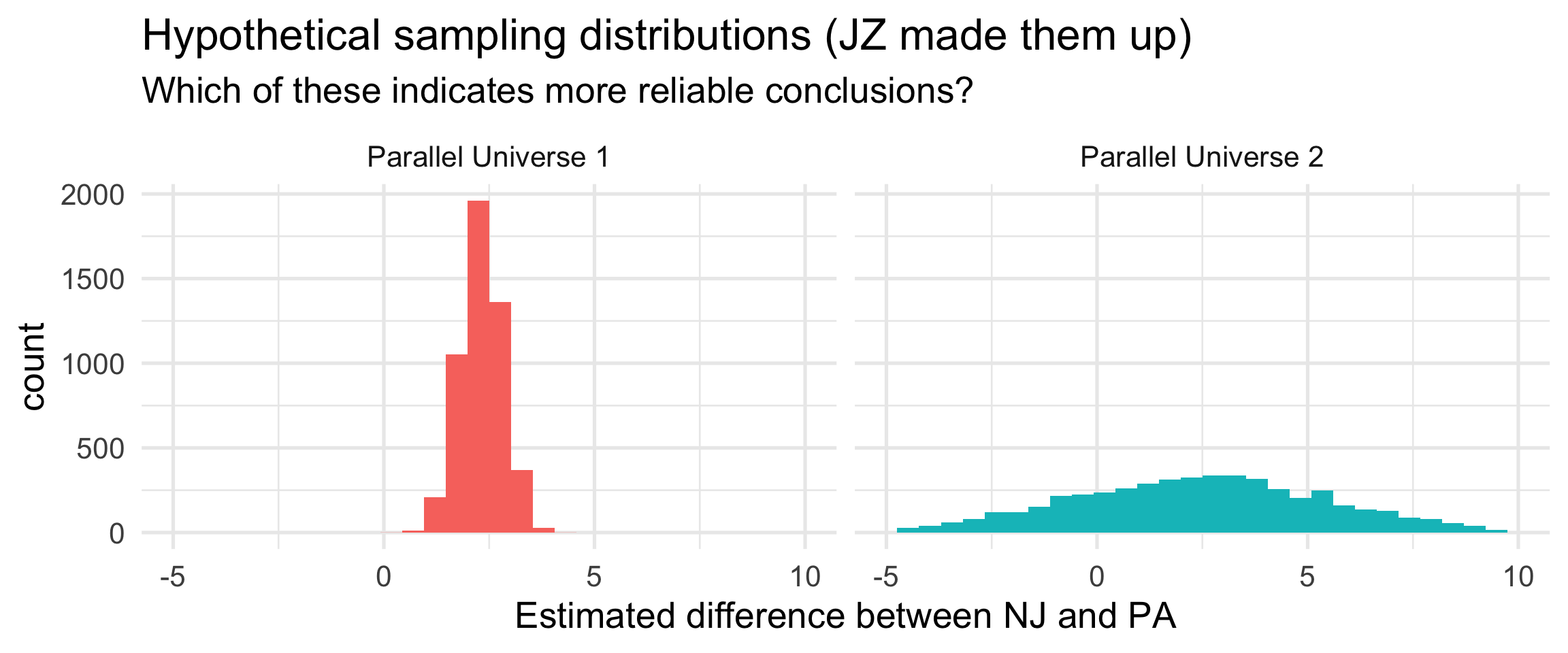
Measuring the spread of the sampling distribution allows us to quantify uncertainty about the conclusions. That’s what the standard error does.
More on all that in…nine weeks.
Data analysis is just a sophisticated form of rhetoric. We’re trying to marshall facts to convince other humans of claims. If a living, breathing person is not convinced, then none of it actually matters.
So…
Card and Krueger argue that the placement of restaurants on either side of the NJ/PA border acts as if an experiment took place, and so any observed discrepancy between the two states can largely be attributed to the causal effect of the minimum wage hike alone.
Do you think this is plausible?
Dive in if you’re interested:
These will last us fifteen weeks (and then some!):
Every coding task in this class will be some combo of these two things:
Building cakes (ggplot) 
Stacking dolls (pipe |>) 
Master these, and everything will be coming up roses!
Also, please complete the Getting to Know You Survey.